10/29/2021

Final Frightful Friday

It's my last Halloween post for 2021 and I thought I'd revisit three of my favorite previous Halloween cards.

The first was made back in 2017 for a color challenge at Splitcoaststampers - orange, green and purple.  Kind of classic Halloween colors, don't you think?  I used a cute MFT Birdie Brown image. This was one of my earlier cards using Copic markers.  In some ways I like it better than how I'm coloring now.  I took more time back then.  I really need to slow down my coloring and be more deliberate with it again.

 My second card is for a Tic Tac Toe Challenge from last year.  I dug out my Cookie Cutter Halloween stamp set and punch.

This is one of those stamp sets I purchased and didn't use for years - basically until I started to really look into cards being made with it.  I'm so happy I did not get rid of it.  I still haven't used it much for Christmas (I have that stamp set too); maybe this year!

Finally, I have a card from 2018 made using all die cuts from Cottage Cutz.  These adorable little ghosts went together quickly.  The background is a wash of grey with bats stenciled in.


I hope you have enjoyed looking back on some of my favorite cards.  If you would like more information on each of the cards please click on the photos.  It will take you to the original post with all the products used and marker colors.

Happy Halloween!


Thanks for visiting today!  Follow me on Instagram, Pinterest, Facebook and Bloglovin'


post signature

10/28/2021

Tips for Coloring a Complex Image

Hi everyone!  Team O has another challenge for you at Tic Tac Toe Challenge blog this week.  If you haven't tried this challenge you really should.  You get to pick which items to use and you can create a card in any style.  A lot of fun!


This week I officially went with the right hand column - Any Shape Die / Snow / Tree, but may card also fits the middle row - Critter / Green or Blue / Snow.  Which one do you think it fits best?

This image was a bit tricky to color in that it’s pretty complex with so many pets and browns  and greys.  I used a variety of Copic markers but I needed to keep track of them and make sure I was coloring the critters with a good mix of the neutrals.

To do this I made a quick stamp and a rough coloring of the image.  This is one of those steps that probably takes me an extra 15 -20 minutes but can save me lots of heartache and time to avoid I coloring something and then deciding it just isn't working.

And since I list all my colors on this photo I also save time by not having to list them down below!  LOL!

I hope you've like my card today and will join us in this fun challenge this week!

Products used:

  • Stamps/dies: MFT Paw La La La La
  • Die: The Stamps of Life "Joy"

Thanks for visiting today!  Follow me on Instagram, Pinterest, Facebook and Bloglovin'


post signature

10/26/2021

Blessings of Home Sneak Peek

Happy Tuesday! I love the sketch challenge at CAS Colours & Sketches this week.  I always love the sketch when it has "any shape" in the description!  So many possibilities!


I made this card for my mother-in-law using a sneak peek from Stampin' Up!'s 2022 Spring Mini catalog.  I got this set to use while attending  On-Stage at Home.  Although I have WAY too many floral stamps I really love this one.  The flowers just speak to me and I'm itching to color them all!

The sentiment seemed to fit my mother-in-law - she is the sweetest person you could ever meet.  I plan to give this to her along with some Anna Griffin dies.  They are just her style (as is this card).

I hope you will join us this week in the sketch challenge!


Products used: All Stampin’ Up! Unless otherwise noted
  • Stamps: Blessings of Home
  • Dies: Flowers of Home, Rectangle Stitched
  • Card stock: Basic White, Powder Pink
  • Markers (Stampin’ Blends with darker Copics to coordinate noted after): Old Olive Light & Dark, Mossy Meadow Light & Dark; Soft Succulent Light & Dark, Evening Evergreen Light; Daffodil Delight Light & Dark, Mango Melody Light; Pink Pirouette Light & Dark, RV34; Highland Heather Light & Dark, V17
  • Accessories: Subtle 3D embossing folder, Opal Rounds, Label Punch

Thanks for visiting today!  Follow me on Instagram, Pinterest, Facebook and Bloglovin'
post signature

10/25/2021

Mono-tonal Colors

Good evening!  My card tonight is for the color challenge at Splitcoaststampers.  Karen chose Petal Pink, Mint Macaron and Pool Party.  Three beautiful soft pastel colors.  I opted to make a non-traditional color Christmas card and use my September Large Die of the Month from Spellbinders.  This bird can make a variety of card types because it comes with flowers along with these circles which reminded me of ornaments.

Since the colors were all similar in value I decided to make the rest of the card white to add contrast.  This card was actually a bit time consuming.  Although I had the layout pretty much done in my mind it was the bird that gave me trouble.

Why the bird?  The colors this week are very singular in value.  I'd call it monotone but I know that word refers to sound (hence the hyphen in my blog title).  And I can't call them monochrome because that refers to a single hue with varying shade / tones / tints.  Think an all pink color scheme.

Colors that are monochrome can still have a wide variety of contrast and therefore are much easier to work with.  With colors that are mono-value, you need to be careful or your design can be very flat.  Black and white films and old TV are all monochrome but were easy to watch and appreciate by using an infinite variety of greys.

To tell if a color scheme is mono-value, take a photo with your phone and convert to black and white.

Here is my bird in black and white.  You can see the bird is fairly flat.  In the color card the hues of the Pool Party and Mint are quite close but the Pink offers a nice contrast in hue.  In black and white the contrast is quite different - the Mint stands out.  My challenge this week was the similarity of the colors (Mint and Pool Party) and the values (Pink and Pool Party).

Below are some photos of color schemes to help illustrate. The top is this week's colors.  The middle are last week's colors (chosen by me), which are also pretty mono-value although when in color they have great contrast of hue.  The bottom one is an example of monochromatic with a variety of values.


I find  a palette with a contrast of values or hues easier to work with as it allows for greater depth - especially if you aren't coloring your image and are using flat colors, such as die cuts.

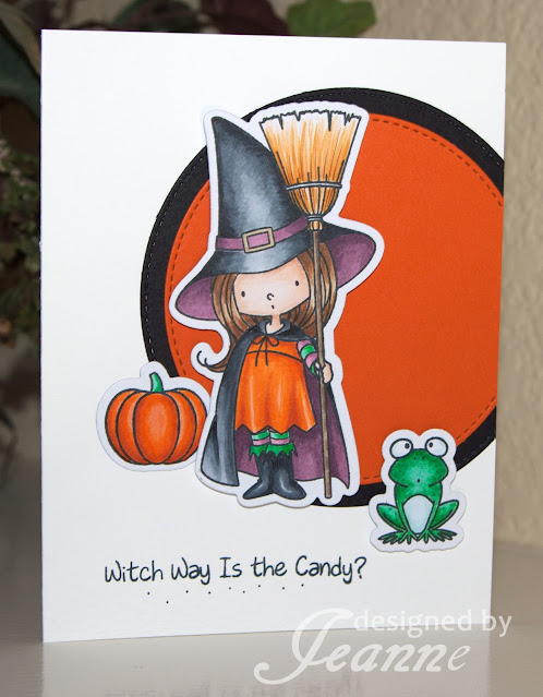
To help you visualize values, hues and contrast here are a few more card examples:

I hope I have made you think a bit about color choices in your card making.  Ultimately it all comes down to what YOU like and what YOU think looks good!  I really like how my bird card came out and I view it as a success even though I probably would not have picked those colors.  That is a great thing about color challenges - they can take you out of your comfort zone.  In this case it really made me think and choose carefully.

Products used:

  • Dies: Spellbinders Large Die of the Month September; The Stamps Of Life Mini Slimline Stitched Rectangles
  • Paper: Basic White, Mint Macaron, Powder Pink, Pool Party
  • Accessories: Pine Boughs EF, ribbon, opal accents

Thanks for visiting today!  Follow me on Instagram, Pinterest, Facebook and Bloglovin'

 
post signature


10/22/2021

Frightful Friday 4 - Shaker Card

My card today is a fun shaker card featuring an adorable vampire - can there even be an adorable vampire?  YES!  This little guy from Queen & Company is one.


I actually made this card for the color challenge this week at Splitcoaststampers.  I am also the hostess this week and picked the colors - Granny Apple Green, Gorgeous Grape and Pumpkin Pie.  These colors are just made for Halloween.

Queen & Co. makes shaker cards easy and fun.  I would definitely recommend them to crafters of any level although you do need to have some supplies that newcomers to cardmaking may not have - like a die cutting machine.  The kits come with the dies, shaker elements, paper, pre-cut foam and acetate.  These kits aren't the kind that make a pre-designed card but there is a lot of inspiration for layouts on the Queen & Co. website.
 
Products used:
  • Shaker kit: Queen & Co. Happy Haunting
  • Paper: Queen & Co. Happy Haunting, Petite Patterns, Pumpkin Pie
  • Dies: Queen & Co. Foundations dies 2, 8 and 10, buttons, Stampin' Up! Bat punch

Thanks for visiting today!  Follow me on Instagram, Pinterest, Facebook and Bloglovin'

post signature

10/19/2021

Bloom and Grow

I have a short post for you today.  It's mostly because I had a long weekend and I'm tired!  But I did make a card for the color challenge this week at CAS Colours & Sketches.  Vicky chose some colors that are perfect for floral images so that is the direction I went.


This set, "Bloom & Grow" is one of my all time favorites.  I love to color the flowers in this stamp set.  This is a card I have made before in other colors.  I like the layout as it is bold and simple and allows for placement of a sentiment in the lower right corner if desired.  I did not use one here as I'm not sure how I will use this card.  When I decide I'll place the sentiment on the inside.  This is the type of image that can stand alone.

Also, we are having a design team call for the challenge!  If you are interested please click on the link above for more information.

Products used:

  • Stamps/dies: Stampin' Up! Bloom & Grow
  • Background die: Stampin' Up! Stitched Greenery
  • Markers: (Stampin' Blends were used with color matched Copics for the very lightest shade.  Those numbers follow the Blends name.) Night of Navy Light & Dark, B32; Old Olive Light & Dark, YG21; Rich Razzleberry Light & Dark, RV63
  • Paper: Stampi' Up! Tropical Oasis

Thanks for visiting today!  Follow me on Instagram, Pinterest, Facebook and Bloglovin'

post signature

10/15/2021

Frightful Friday 3 - Another Spooky House

Happy Friday!  I have another 3-D Halloween project for you today.  Like last Friday, this one is a haunted house.  I love house dies and have several from different companies.  Some make 3-D house and some are flat.  This is a retired stamp and die set from Stampin' Up! that makes houses for all seasons. 

Although it is not available on the Stampin' Up! website you can probably find it on the secondary market.  This is one of my "I will never get rid of this set" sets!  I love it that much.  The only downside is that the base is too small to hold a tealight.  Even if it could hold one you would need to figure out how to make it open up to turn on the light.


I used a retired brick look paper and inked the edges to make it look distressed.  For the windows I used Daffodil Delight with Pumpkin Pie ink.  This makes it look like there is light coming in from the windows.  I did not decorate the back but it does offer a lot of possibilities.  I hope this inspires you to get out some older stamps and dies and play with them!

Products used:

  • Stamps: Stampin' Up! Sweet Home, Hardwood
  • Dies: SU Home Sweet Home
  • Paper: Basic Black, Basic White, Pumpkin Pie, Daffodil Delight, Halloween Night DSP
  • Ink: Smoky Slate, Pumpkin Pie, Craft White

Thanks for visiting today!  Follow me on Instagram, Pinterest, Facebook and Bloglovin'


post signature

10/14/2021

Ghoul Friends

The board this week is Halloween themed.  If you're like me you have a ton of Halloween stamps and don't get to use them nearly enough; so now is a good time to begin!  I chose the diagonal - black, orange and purple.


I had a hard time deciding what to do for this board - as a result this card took way longer than it should have.  I'm making a concerted effort to post LOTS of Halloween cards this month.  At least one every Friday and more throughout the week when I can.  I have taken out every Halloween stamp set I have (that's how I discovered how many I own) and I'm trying to use ones that haven't even been opened.

This is one from 2019!  I'm not sure why I hadn't used it before; the faces on the vampire and mummy are pretty darn cute.  After agonizing over the stamps to use I found the layout took a while.  I wanted to make a slimline card and the frames filled the space nicely.  However, I was in that wishy-washy mood where I felt I had to try every color combo - orange or purple frame in the middle, or all the same color frames?  Do I add a panel under the white and if so what color?  You get the idea - you've probably there.

I hope you join us in the challenge.  And don't forget to come back tomorrow; I have a 3D Halloween project!

Products used:
  • Stamps: Stampin’ Up! Spooktacular Bash
  • Dies: Stampin’ Up! Ornate Frames, Cottage Cutz Stitched Slimline Rectangles
  • Paper: Pumpkin Pie, Gorgeous Grape, Witches Brew DSP, Basic White
  • Ink: Memento Black, Smoky Slate
  • Markers: Stampin’ Blends - Highland Heather Light , Granny Apple Green Light and Dark, Pumpkin Pie Dark; Copics - V01, V000, E40, E41, E43
  • Accessories: Matte Black Dots, Metallic Photo Corners
 
Thanks for visiting today!  Follow me on Instagram, Pinterest, Facebook and Bloglovin'

post signature

10/12/2021

Purr—fect Halloween

Vicky's sketch at CAS Colours & Sketches this week offered a lot of possibilities.  I'm trying to make as many Halloween cards as I can this month, so I opted to use this fun set from the Stampin' Up!'s fall mini catalog.  I love this set because there is a different cat in it that reminds me of our huge red Maine Coon mix.  But for this card I just used the sneaky little cat eyes.

This card was super simple to create. I did die cut my top portion first and then stamped the images.  I also stamped the orange layer first.  When I stamped the pumpkin outline first, the orange "diluted" the black.  I like that the solid and the outline don't have to line up exactly.  It makes it so easy to stamp and look good.

Products used:
  • Stamps: Stampin’ Up! Clever Cats
  • Dies: My Favorite Things Stitched Scallop Basic Edges
  • Paper: Basic White, Cute Halloween
  • Ink: Memento Black, Pumpkin Pie

Thanks for visiting today!  Follow me on Instagram, Pinterest, Facebook and Bloglovin'
 
post signature

10/11/2021

Christmas Pudding Celebration

Mary's colors this week for the color challenge at Splitcoaststampers are perfect for Christmas - Polished Pink, Cinnamon Cider, Coastal Cabana. I thought about making a gingerbread card (one of my favorite themes) but I decided to use this new set.  I've had it a few months now and have yet to ink it up.

I colored the image in a combo of Copic markers and Stampin' Blends.  The paper is from Queen & Co. and is color matched to the challenge colors.

I wanted things to be pretty sparkly (hard to see in the photo) so I used Wink of Stella on the pudding frosting and used Crystal Effects on the berries.  I also used sparkly jewels from Queen & Co. for my shaker elements.

Products used:
  • Stamps: Stampin’ Up! Sweets & Treats
  • Dies: Stampin’ Up! Cloche Dies, Cottage Cutz Celebrate with Shadow, The Stamps of Life, Scalloped Rectangles
  • Paper: Basic White, Cinnamon Cider, Queen & Co. Fruit Stand & Petite Patterns 
    Markers: Stampin’ Blends Polished Pink Light & Dark, Cinnamon Cider Light & Dark, Pool Party Light & Dark; Copics: BG0000, BG000, E13, C00, C0, C2, C4, C6
  • Accessories: Stampin’ Up! Cloche shaker, Subtle Embossing Folder, Queen & Co. button and shaker jewels, Wink of Stella, Crystal Effects
 
Thanks for visiting today!  Follow me on Instagram, Pinterest, Facebook and Bloglovin'


post signature

10/08/2021

Frightful Friday 2 - A Spooky House featuring Lawn Fawn

Happy Friday!  I have another Halloween project for you today.  This time it is a cute 3-D box / house.  I love decorating with 3-D projects.  They are so much fun! 

This project features the Lawn Fawn Scalloped Treat Box and Haunted House Add-On dies. It's fairly simple -  I used black and grey throughout with a few other colors mixed in.  The house is stamped in grey ink with a crackle paint background stamp to give it a "weathered" look.  To emphasize the shingles I sponged on some white craft ink.  I placed a piece of white cardstock behind the cat's head and used markers to color the eyes and nose.


For the window openings, I cut vellum.  It makes for a spooky look when you place a battery operated tea-light inside. (See photo #1)

Products used:

  • Dies: Lawn Fawn Scalloped Treat Box and Haunted House Add-on dies
  • Stamps: Stampin' Up! Crackle Paint background stamp
  • Paper: Basic Grey , Basic Black, Basic White, Crumb Cake, vellum
  • Ink: Basic Grey, White Craft, Crumb Cake
  • Accessories: Metallic gem (doorknob)

Thanks for visiting today!  Follow me on Instagram, Pinterest, Facebook and Bloglovin'

post signature

10/05/2021

Bold Flowers

Vicky gave us some bold colors for the challenge this week at CAS Colours & Sketches - Poppy Parade, Pacific Point and Garden Green.  I felt they deserved a bold image.

While searching for a floral stamp to use I came across this Spellbinders die from 2019.  I was a member of their die of the month subscription and have so many that I have never used.  This is one.  It actually makes a pop-up card if you're so inclined.  Since this is a CAS challenge I left that for another day.  I love it when I can finally use something I've never used before and I challenge you to do the same!

Products used:
  • Dies: Spellbinders Pop-Up Garden (Large Die of the Month 2019)
  • Paper: Poppy Parade, Pacific Point, Garden Green, Basic White

Thanks for visiting today!  Follow me on Instagram, Pinterest, Facebook and Bloglovin'
 
post signature

10/04/2021

Magic Iris Birdhouse

The colors Chris picked for Splitcoaststampers this week were inspired by her trip to Alaska.  She chose Black, Real Red and Bermuda Bay with the added dessert option of "weathered."

I thought my card would look a bit different but it was also one of those that just sort of evolved as I had no real plan when I started it.  I really don't know what I was expecting!  However, I do like how it turned out.  The center of this birdhouse can be interactive with an iris that open like a camera shutter.  If I had more time (or felt more adventurous) I would have done that and put a sentiment inside.  I will try that at some point because there are a lot of great cards using the Magic Iris!

For my weathered look, I used some retired weathered wood patterned paper that I further distressed by inking the edges.  I used a Timber embossing folder to emphasize the wood.  I also edged the bird and birdhouse roof/base in their coordinating inks colors.

Products used:
  • Dies: Lawn Fawn Magic Iris Birdhouse, The Stamps of Life Scalloped Rectangles
  • Paper:  Real Red, Bermuda Bay, Basic White, Basic Black, Crumb Cake, retired wood DSP
  • Ink: Real Red, Bermuda Bay, Crumb Cake
  • Accessories: Stampin' Up! Timber Embossing Folder and Gingham Ribbon

Thanks for visiting today!  Follow me on Instagram, Pinterest, Facebook and Bloglovin'
 
post signature

10/01/2021

Frightful Friday - Cutest Halloween

Happy Friday!  I'm going to try something new for October.  Every Friday I will post a Halloween card.  I love Halloween; it may be my favorite holiday for decorating.  But I don't do the scary stuff. I'm the cute cats, bats and trick-or-treater kind of decorator.
My card today features the paper and punch from the Stampin' Up! set Cutest Halloween.  It also features the stamps (just a little) because the ghosts' faces and arms are stamped. I sponged the edges with a little Highland Heather and added some Stampin' Blends in Pink Pirouette Light for the cheeks.

Because this paper is so darn cute I made a flip-it card to showcase it.  I did use a die from The Stamps of Life for the card, but instructions on how to make your own can be found easily online.
I finished off the card with gingham ribbon and self adhesive star sequins.

I hope to feature products from several different companies for Halloween.  And keep a look out during the week for Halloween themed cards as well.  I'll use Halloween for my challenges as appropriate!

Full disclosure - I am a Stampin' Up! demonstrator.  If you like the card today and would like to purchase the products, I would love to be your demonstrator if you don't already have one.  Links are below.

Products used:

Thanks for visiting today!  Follow me on Instagram, Pinterest, Facebook and Bloglovin'

post signature