2/25/2020

Happy Leap Day - a Few Days Early

It's almost Leap Day so I have a card for that celebrates that day!  I used dies to make this card but you can easily make one of the same theme using stamps.
I used Distress Oxide inks to color the frog and foliage.  For my sentiment, I stamped the happy from a birthday sentiment set and then created the "leap day" using an old small wood mount alphabet set I have.  I rarely use it because it's so hard to get the letters lined up evenly and straight, but for this I stamped each letter at an angle.  Not only did I not have to worry about it being perfect, but the up and down adds to the "leap" theme!

I don't normally use a lot of patterned paper on my cards but this card was a bit dull on a white background.   I think the subtle green added a bit of interest and complements the blue paper of the water.

This card is for the sketch challenge this week at CAS Colours & Sketches.  I hope you'll join us this week and submit a card!
https://cascoloursandsketches.blogspot.com/2020/02/challenge-359-sketch.html

Dies: Cottage Cutz Spring Frogs and Stitched Circles
Stamps: Stampendous Happy Messages; Stampabilities Vintage Type Alphabet
Ink: Distress Oxides Forest Moss, Peeled Paint, Shabby Shutters, Gathered Twigs, Scattered Straw, Vintage Photo
Paper: Stampin' Up! Tropical Oasis and Peaceful Poppies

Thanks for visiting today! Click here to sign up for email notifications of future posts (you will be sent an email to verify your address - don't forget this step).  Follow me on Instagram, Pinterest, Facebook and Bloglovin'.


post signature

2/24/2020

Tips for Working with Complex Die Cuts

I fell in love with this die when I first saw it!  It's Spring Blooms from the Cottage Cutz 2020 Spring release.  This is one of those dies that looks incredibly stunning (and intimidating.)  Really - who wants to glue all that together?  It looks great, but....

Well, today I am going to share how I made this card and it was much faster and easier than it looks.
I'll share a few tips and tricks that made it go quite quickly and smoothly.

I decided to use a limited color palette - Rich Razzleberry, Pretty Peacock and Old Olive - the color challenge colors this week at Splitcoaststampers.  By limiting my colors, the choices for all the flowers was dramatically reduced.  But I still wanted more than two colors of flowers.

So, I die cut all the pieces from white cardstock and divided them into three cups - one for each color. 
I colored the white pieces using sponge daubers.  This is much faster than trying to die cut the flowers from different colors of cardstock.
And you can see that by doing this I get variety of pinks, blues and blends giving me more than just two colors.  I also used the blue with the green to give me both light and dark green stems.  (I did cut a few leaves from vellum and two centers from gold foil.)
The next step was to assemble all the flowers.  This could be tedious, but I found an easy way to do this.  I used my silicone mat so nothing would stick to the surface.  (Tip - you can use a silicone baking sheet for this as well.  You won't want to use it for baking afterwards but I know big box stores will sell these in packs of three or four.)
And this is key - instead of trying to place the flowers on the stems, I placed the stems on the flowers.  I left the tiny buds randomly on my sheet and used fine tipped Art Glitter Glue to put a tiny dot on the end of each bud.  Then I moved the stem to each one and picked it up.  Because of the mat, the bud sticks to the stem and not the surface.  When I was done I laid them on the mat to dry.  It went very fast.
Next I worked on the card base.  I cut a panel 4.25 x 5.5 inches and cut two circles using the second and third largest of the Stitched Circle dies.   The larger one is cut from green foil cardstock.
Without gluing them together, I put them on top of each other and laid out some of the flowers to give me an idea of where I wanted my sentiment.  Then I transferred the white circle and sentiment to my stamping platform and stamped the sentiment in black.
After centering the stamped sentiment circle on the foil circle I glued them both to the front panel higher than center leaving enough space for a small floral spray in the lower right corner.

I placed all the pieces where I wanted them, took a photo with my phone so I could remember details and carefully removed the top layer.  Then I started gluing them down.  Having a photo for reference has helped me many times in the past when I forgot where a piece went or at what angle.  I also use my phone if I can't decided between two versions of a layout.  I take a photo of each and can switch between the two to see which I like better.
To complete the card, I used small colored rhinestones for the flower centers rather than tiny die cut circles.

I hope you enjoyed today's card and learned a tip or two on how to make the creative process a bit easier!

Dies:  Cottage Cutz Spring Blooms, Cottage Cutz Stitched Circles
Ink: Rich Razzleberry, Old Olive, Pretty Peacock
Cardstock: Whisper White, Old Olive Noble Peacock Foil Sheet, vellum
Accessories: Noble Peacock Rhinestones

Thanks for visiting today! Click here to sign up for email notifications of future posts (you will be sent an email to verify your address - don't forget this step).  Follow me on Instagram, Pinterest, Facebook and Bloglovin'.


post signature

2/18/2020

Be Still and Listen

Today I'm featuring another card that has Prismacolor pencils over Copic markers.. The image is from one of my favorite new series at Stamping Bella - the Bundle Girls.
This image is for the color challenge this week at CAS Colours & Sketches.
https://cascoloursandsketches.blogspot.com/2020/02/challenge-358-colors.html
I felt the colors worked well with this image.  And it was fairly fast to color as the flowers just needed a bit of shading.  Because the colors are so light it was difficult to get the added touch of shadows needed with only markers.  So I went over the image with pencils.  While the pencils did add depth and smoothness, it is not as evident as in other cards I've colored.  However, I didn't take photos of those and I did this time!  I'll have to remember to take before and after photos again, on an image where it really shows.  This is with just the marker:
And here it is with the pencils on top:
You can see how it added a bit more contrast and smoothed out the shading.

I wasn't sure about the sentiment until I ran across this one.  I had never used it before but it seemed tailor made for this image!  I added the frame in white and stacked three Daffodil Delight frames underneath giving it just a hint of yellow.

Stamps: Stamping Bella Bundle Girl with Flower; Impression Obsession C19088
Cardstock: Whisper White, Daffodil Delight
Ink: Copic markers & Prismacolor pencils (markers are listed first, pencils listed by number only) - Daffodil Delight Y11, Y13, Y15, 916, 1003, 1012; Grapefruit Grove YR00, YR61, YR65, 921, 1001; Pear Pizzazz G20, G40, G43, 912,1096; Skin E00, E01, E11, 997,939;  Dirt E53, E55, E54, 943, 945; Shadows N0, N1, 1065
Accessories: rhinestone

Thanks for visiting today! Click here to sign up for email notifications of future posts (you will be sent an email to verify your address - don't forget this step).  Follow me on Instagram, Pinterest, Facebook and Bloglovin'.

post signature

2/17/2020

Little Stinker

This card is for the color challenge this week at Splitcoaststampers. The colors are Terracotta Tile, Coastal Cabana and Granny Apple Green.  While these didn't immediately scream FLORAL to me I had an idea about using a skunk in a floral wreath and decided these colors would work.  And I had no other idea what to do with them.  Sometimes with challenges, you have too many ideas and other times not a one.
The card went quite quickly.  I ran the die through my die cutter several times in the colors.  Because I didn't want as many Terracotta flowers as the blue I didn't have to run quite as many in that color; however, I needed the same number of centers as blue flowers.  So I use my 1/16 and 1/8 inch punches to cut some of the centers!  The dessert option is an embossing folder and originally I was not going to use one until I found this one in my stash.  The style was so perfect I just had to use it!


Stamps: Stampin' Up! Hedgehugs, Stampin' Up! Swirly Frames, Stampin' Up! Perfect Words
Dies: Cottage Cutz Spring Lamb & Chick (flowers)
Ink: MFT Black Hybrid, Stampin' Up! Crumb Cake, Copic marker N0 (shadow on skunk)
Cardstock: Whisper White, Terracotta Tile, Coastal Cabana, Granny Apple Green
Accessories: Stampin' Up! Spring Flowers Embossing Folder

Thanks for visiting today! Click here to sign up for email notifications of future posts (you will be sent an email to verify your address - don't forget this step).  Follow me on Instagram, Pinterest, Facebook and Bloglovin'.

post signature

2/11/2020

The Two Hour (Ten Minute) Card

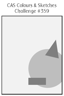
I've done these posts before.  The one where the card takes WAY longer than it should have.  Often it's because things so horribly wrong - dropping my ink pad on the almost finished card or a marker drips, etc.  But today's card just took a long time because of decisions.  And it was for a sketch challenge so THAT decision was done when I started the card!
It is also for an inspiration challenge where I used the colors.  Another decision made.

So, why did it take so long?  I have a LOT of patterned papers and it just took awhile to decide.  When cards are simple, the simple choices can have a big effect.  So, I had to decide on the dots versus a check, and then what size dots.  Should the frame be black with a red insert or red with black?  Or something else? I did many die cuts and just started playing with the pieces until I arrived at something I liked.

As for the sentiment, I was looking for a Valentine's day one (even though I don't need another Valentine card) because what else would you do with this card?  When I saw this I knew I had to use it.  I can always use another thank you card!  It would have been hard to make this a thank you without the "heartfelt" in the sentiment.

Now for the ten minute version.  As I was picking up and putting things away, I realized I had almost enough leftovers to make at least one more card and if I didn't do it right then, I'd probably never do it.  I chose the kraft color for the tag and base as it tones down the "love" aspect and I think makes for a better thank you card.  Ten minutes later - I was done!
This one took about 10 minutes to make.  That is one thing about CAS cards.  Very often, after the first one is made subsequent cards go very quickly.

The challenges for the card are:
Stamps: Simon Says Stamp Thanks
Dies: The Stamps of Life Double Hearts, MFT Gift Tags, MFT Banner
Paper: MFT Black & White Basics, Stampin' Up! Botanical Blooms, Real Red, White, Black, Crum Cake
Accessories: Provo Crafts Dots embossing folder

Thanks for visiting today! Click here to sign up for email notifications of future posts (you will be sent an email to verify your address - don't forget this step).  Follow me on Instagram, Pinterest, Facebook and Bloglovin'.

post signature

2/10/2020

Chocolate Helps

My card today is for this week's color challenge at Splitcoaststampers.  And let me just say that Mango Melody is NOT my favorite color.  Yet when all was said and done, it pretty much took center stage on this card.
The colors to use are Mango Melody, Pumpkin Pie and Pool Party.  Fortunately Stampin' Up! makes blends in those colors so I had less color matching to do.  I do like to use colors that are lighter than what SU offers so I usually add Copics to the mix.

After coloring with the markers I went back over the image with Prismacolor pencils.  I find I can get much more detailed this way.  It's a technique I learned many, many years ago using Prismacolor markers under the pencils. Sometime I will remember to take a before and after Prismacolor photo so that you can see the difference.
I decided to add actual buttons to the cart and thought I could save time by not coloring the wheels.  Well when I put the buttons on, even though they are slightly larger than the stamped wheels, you could see a bit underneath the buttons.  This is because the thread caused the buttons to be a fraction of an inch up from the paper. I ended up taking them off and coloring the wheels in the Pool Party.  No shading, just a flat color.  It is something I will do from now on when adding embellishments like this.  It didn't take much time at all.

Stamps: Stamping Bella Bundle Girl with Chocolate Bunny, Chocolate Sentiments
Dies: Queen & Co Simple Borders, MFT Dome Stax and Tag Builder #5
Paper: Doodlebug Happy Camper, Mango Melody, Chocolate Chip, Pool Party
Accessories: Pumpkin Pie ribbon, Subtles buttons
Markers: Stampin' Blends Pumpkin Pie Light & Dark and Copic YR000; Stampin' Blends Pool Party Light & Dark and Copic BG0000; Stampin' Blends Mango Melody Light & Dark and CopicY11; chocolate E25, E29, E21, E23; grass Stampin' Blends Mossy Meadow Light and CopicYG61; skin E01, E00, E11
Prismacolors: Mango - 916, 917, 1002, 1003; Pumpkin  118, 1033, 1032; Pool Party 905, 922, 1086; chocolate 1082, 947, 946, 945; grass 1005, 988, 1097; skin 933, 939, 997

Thanks for visiting today! Click here to sign up for email notifications of future posts (you will be sent an email to verify your address - don't forget this step).  Follow me on Instagram, Pinterest, Facebook and Bloglovin'.


post signature

2/04/2020

Inlaid Die Cutting

My card today celebrates Valentine's Day and a birthday.  I have a friend born on February 14.  This is one of those subjects that can get a bit touchy.  Do you send one card or two?  Well, since I wouldn't normally send her a Valentine's card I don't feel like I'm cheating her with one card.  And truly it's not a Valentine's card - it only says "Happy Birthday!"  I simply use hearts and the red/pink colors as a theme.  Last year's card had a birthday cake in reds and pink.
The card uses an inlaid die cut technique.  I've done this before and it can get pretty intricate, but not so much this time.  To do this technique, cut your die from the color you'd like as your frame and as many colors as you'd like to inlay.  In this case, just two.  Save all the pieces.
After gluing down the frame, insert the pieces.  It's rather like a jigsaw puzzle.  I did try to keep things somewhat organized when I removed my pieces from the die and put them in piles for the upper part, middle part and lower part of the frame.
I only wanted to highlight part of the die since I thought it would be too busy for the zebra if it was all filled in.  By varying the colors some hearts are in front and others behind.

This was a simple card to make (zebra equals little coloring) and is for the color challenge this week at CAS Colours & Sketches.  I hope you'll find time to join us.
https://cascoloursandsketches.blogspot.com/2020/02/challenge-356-colors.html

Stamps: MFT Zippy Zebras, MFT Anything But Basic Birthday
Dies: MFT Zippy Zebras, MFT Hearts Entwined
Cardstock: Real Red, Flirty Flamingo, Silver
Ink: Copic markers N0 and N1; Stampin' Blends Flirty Flamingo Dark (ears) and Real Red Dark (flowers)

Thanks for visiting today! Click here to sign up for email notifications of future posts (you will be sent an email to verify your address - don't forget this step).  Follow me on Instagram, Pinterest, Facebook and Bloglovin'.


post signature

2/03/2020

An Anti-Valetine

This card is an anti-valentine Valentine for my husband.  Basically, this is me in the morning.  I'd like to think I'm sparkly, sunshine and rainbows in the morning - like a unicorn.  But in reality....not so much.
I'm closer to this.  I tried to give her mane a dulled look and purposely avoided any sparkle on the card.  How hard is THAT with a unicorn?

So why is this an anti-Valentine?  For one, it's for the current challenge at Sisterhood of Snarky Stampers.
https://snarkystampers.blogspot.com/2020/01/soss-152-is-for-anti-valentine.html
And for another, most Valentine's cards don't use the terms "stuck" and "get used to it".  But hubby and I have been together now for 38 years (married for 35) so they may be appropriate! :)

Stamps: The Rabbit Hole Designs Caffeinated Unicorn
Sentiment: Simon Says Stamp Sentiment Strips
Inks: Copic markers R81, R83, R85, RV000; C00, C0, C1; N0, N1, N2, N4; R01, Y11, G40, B41, V22; Y11, Y13, Y15; E47, E49

Thanks for visiting today! Click here to sign up for email notifications of future posts (you will be sent an email to verify your address - don't forget this step).  Follow me on Instagram, Pinterest, Facebook and Bloglovin'.

post signature