1/30/2019

Hey Love - Easy Valentines

There are no children in my family right now, so a set of Valentine stamps aimed at kids is not something I would normally buy.  But after considering this set, I just couldn't resist.  I think giving out Valentine's is fun no matter what your age - we all like knowing someone thinks we're special!
These cards were made using dies but could easily be made with a paper trimmer and punches.  I also used a Scan 'n Cut on the ape but only because don't like fussy cutting!   I used pre-made note cards.  All have some dimension - the skunk's circle and the white rectangle on the otter card are popped up using foam dimensionals.  The ape could be popped up the same way, but I used an "action wobble" so he actually jiggles!

The stamp set includes three additional critters - an alligator, a bird and beaver.  The coloring is simple - no shading.  Super easy and fun cards to make that are appropriate for everyone!

Listed below are the supplies.  It seems like a lot but my guess is you probably have some of them in your stash.  If you are new to stamping these are all basic, good supplies that can be used in many projects.

Stamps:
Hey Love
(Requires the use of an acrylic block - I recommend sizes D and B as good general purpose ones)
Dies (Requires a Big Shot.  For new stampers I'd recommend the trimmer and punches):
Stampin' Up! Rectangle  Stitched Shapes
Stampin' Up! Stitched Shapes
Stampin' Up! Layering Circles
Stampin' Up! Be Mine Stitched
Alternates:
Paper Trimmer
Circle Punches
Accessories:
Stampin' Blends - Real Red Dark, Soft Suede Dark, Crumb Cake Dark, Smoky Slate Light and Dark
Pick a Pattern Washi Tape
Note Cards
Foam Dimensionals
Real Red Cardstock
Whisper White Cardstock

Thanks for visiting today!  Click here to sign up for email notifications of future posts (you will be sent an email to verify your address - don't forget this step).  Follow me on Instagram, Pinterest, Facebook and Bloglovin'.


post signature

1/29/2019

Double Challenge Card - Colors and a Sketch

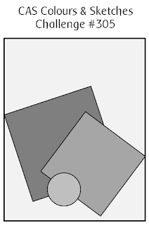
Happy Tuesday!  Today is my last day as the challenge hostess at CAS Colours & Sketches.  Since it's the fifth Tuesday we have a double challenge - both colors AND sketches.  I realized after I had made my picks that I must love angles on cards because  this sketch also features some angles as did last week's sketch!
The colors were some Stampin' Up! colors that I hated to see retired.  Although I know that Stampin' Up! has to make room for new colors - that I also love - I wish they hadn't retired THESE.  Isn't there room in everyone's craft stash for every color ever made?!?
Double challenges can be quite difficult, or in this case, pretty straightforward.  Most of my decisions were made for me.  I did make one of the tags a bit smaller.  I originally made it the same size but liked the smaller one better so I went with that.  The flowers are two step stamping, so I stamped off the first layer to get shades of the colors.

After it was all finished I felt it needed a little something so I added some Nuvo drops in Morning Dew.  They are translucent and have just a touch of shimmer.  I made them  pretty small so you can't see them very well.  If I had to do it over I'd put on less drops and make them larger.  They are even hard to see in this photo!
This card will probably end up as a birthday card but could also be a thank you.  The sentiment is from the Beautiful Bouquet stamp set and is one of my all-time favorites!  It goes with any floral image and is in pretty fonts.

Stamps: Stampin' Up! Beautiful Bouquet (sentiment); Stampin' Up! Jar of Love
Dies: Stampin' Up! Everyday Jars; Cottage Cutz Mail Tags, Cottage Cutz Spring Wreath
Ink: Stampin' Up! Elegant Eggplant, Wild Wasabi, Sweet Sugarplum - all retired
Paper: Elegant Eggplant, Wild Wasabi, Whisper White

Thanks for visiting today!  Click here to sign up for email notifications of future posts (you will be sent an email to verify your address - don't forget this step).  Follow me on Instagram, Pinterest, Facebook and Bloglovin'.


post signature

1/22/2019

Working with Angles and a Birthday Fish

Hi everyone!  This Tuesday I'm the hostess at TWO - challenges CAS Colours & Sketches and Splitcoast Stampers Color Challenge.  Last weekend was a busy one for me, so I decided to combine the challenges.
Here are the posted challenges:
and the colors Pool Party, Coastal Cabana and Calypso Coral:
Even though I picked the colors and designed the sketch they both proved challenging.  Angles add interest to a card (in my opinion) but they can also offer challenges.  This was no exception.  The image I had originally planned to use was too large to fit on the card using this layout.  Objects when placed at an angle take up more space.  This bear works because he is basically a triangle and fits nicely into the square.  My first image was rectangular and to fit it in, my square would have been HUGE!

I had to be very precise in the addition of the sentiment for it not to look off-kilter. When I had laid out the angles of the two square panels I very lightly marked the top edge of the top panel in pencil on the bottom panel.  This allowed me to stamp my sentiment straight; then I glued my top panel just over the marked line.  The sentiment was perfectly aligned this way.

I wanted just a hint of color behind the panels.  Although I had glued the square panels together I had not yet adhered them to the card.  So I outlined them on card stock and cut that out.
I used that as a  mask and sponged around the edges to get the light shadow of Pool Party.  And I had exactly where I needed to place my panels!

I love working with angles on cards.  For one, they add interest.  Another bonus is that if you aren't comfortable lining things up, or if you are very particular that everything is straight or even, placing elements at an angle lessens this need for precision.  I say "lessens" because you should make sure your angle is enough that it looks deliberate - too little and it may just look "off".  And when working with angles, there are decisions on sentiment placement, like here.  I toyed with making the sentiment parallel to the bottom of the card but decided it was best aligned at the same angle as the top panel.  The mechanics of making that sort of placement happen can be tricky.  Overall though, working with angles on your cards is worth the time you spend.

I hope you join us in our fun "angle sketch challenge" at CC&S and our color challenge at Splitcoast Stampers.  We'd love to see what you create!

Stamps:  MFT Polar Bear Pals
Dies: Cottage Cutz Nested Stitched Squares
Markers: Pool Party Stampin' Up! Blends Pool Party Light & Dark and Copic BG10;  Calypso Coral Stampin' Up! Blends Calypso Coral Light & Dark and Copic R01; Coastal Cabana Copic BG10, BG23, BG32; N0, N1, C00, C0, C1, C2, R000

Thanks for visiting today!  Click here to sign up for email notifications of future posts (you will be sent an email to verify your address - don't forget this step).  Follow me on Instagram, Pinterest, Facebook and Bloglovin'.


post signature

1/15/2019

Birthday Bike Ride

Since it's Tuesday it must be time for more color challenges.  I'm on the team for two Tuesday challenges - the CAS Colours & Sketches challenge and Splitcoast Stampers Color challenge.  You are not allowed to combine color challenges for obvious reasons, but this week I saved a little time (not really, I'll explain) by making the same card in two different color combos!
The challenge for CAS Colours & sketches is Balmy Blue, Real Red and Crumb Cake.
 Neutrals like black, brown, beige and grey are allowed.


At Splitcoast Stampers this week the colors are Rich Razzleberry, Mango Melody and Grey Granite.
For this challenge you can use any Stampin' Up! neutral so that includes, Mossy Meadow, Night of Navy and Merry Merlot.  This expands things a bit and can make it easier at times.
However, this weekend was one of THOSE weekends.  I decided to work on the SCS card first since I pretty much knew what I wanted to do for the CC&S challenge (the bike) so that would be easy.

The card above in the SCS stampers colors was my third attempt at using those colors!

Those colors truly were a challenge for me.  My first card never got past the image.  I tried watercoloring it several times before I decided it really should be colored with Copics.  But by that time I had stamped it in non-Copic friendly ink on mixed media paper.  Since it was a masked image, I decided to go to "Plan B" - some other card.  And I made a very lovely birthday card.  The only problem was that Grey Granite was my main color.  Let's just say a grey birthday card isn't exactly cheerful!

I went to bed.

Sunday morning I decided to work on the CC&S card first.  Since there is a lot of stamp aligning with the bike and accessories, I thought I'd stamp multiple bikes in several colors while everything was lined up in the Stamparatus.  One of my bikes was Grey Granite and well.....you get the rest.  Things went much more smoothly after that.

I learned a few things along the way and will post my really sad birthday card after I make another, more cheerful one.  And it will be fun - I promise!

Stamps and dies:
Stampin' Up! Bike Ride stamps
Stampin' Up! Bike Ride dies
Stampin' Up! Needle and Thread
Inks:
Stampin' Up!
Accessories:
Stamparatus

Thanks for visiting today!  Click here to sign up for email notifications of future posts (you will be sent an email to verify your address - don't forget this step).  Follow me on Instagram, Pinterest, Facebook and Bloglovin'.


post signature

1/11/2019

A Blooming Valentine

I've been in the mood to make Valentine's Day cards this year.  They are so fun to send to friends and family - not just your "sweetheart" (there should be only ONE of those, right?)  So I've been making Valentine's - or "Galentine's" - Day cards.  This one is right up my alley in a clean and simple style.
I started off by watercoloring a background using Real Red and Powder Pink.
I made a scalloped frame for my background by cutting a scalloped square and then using a plain square to cut out the inside.  This makes your dies go farther instead of buying a frame die set.  I didn't measure to get the plain square in the center, I just eyeballed it, but I did use washi tape to hold it down so it wouldn't shift when I ran it through my Big Shot.

I made an A2 card base from white card stock and stamped my sentiment in the Real Red.  Then I cut my watercolor panel to a size in between the inner and outer dimensions of the frame.  About 3 1/2 inches.  This is adhered to the card base and I used narrow foam tape to pop up the frame from the base and put it on top.
My main image is the Blooming Heart from Cottage Cutz.  Whenever I have an intricate die such as this I like to use an adhesive sheet on the back.  The die will cut through all layers EXCEPT the "wax paper" backing of the adhesive sheet.  This works great because the image peels right off like a sticker!
After I attached my frame, I added the main image and some crystal heart embellishments.

I hope you enjoyed this card today.  I had fun designing it and it is one I can easily see sending out to my friends on Valentine's Day to let them know how special they are.

Dies: Cottage Cutz Blooming Heart, Scalloped Squares, Nested Cross Stitched Squares
Stamps:  Paper Smooches Scripty Words
Embellishments: Buttons Galore & More Sparletz Love Hearts

Thanks for visiting today!  Click here to sign up for email notifications of future posts (you will be sent an email to verify your address - don't forget this step).  Follow me on Instagram, Pinterest, Facebook and Bloglovin'.

post signature

1/08/2019

Key to My Heart

A new year has started at CAS Colours & Sketches for challenges!  This month I am the hostess and we're starting off with a sketch.
Here is the posted sketch:
This card is also for this week's color challenge at Splitcoast Stampers - Real Red, Powder Pink and Silver with hearts for dessert.

I colored the main image with Copic markers and color matched them.  Since I wanted to make a background with dye inks and wanted it to be part of my main image (I did not want to cut out right around my image and lay it on top), I knew I had to choose the correct ink for stamping.  My Favorite Things makes a hybrid ink that works well for both Copics and dye inks.  I used it here.  (There are other companies who also make hybrid inks however I haven't tried them.)  After coloring with the Copics, I went back with Prismacolor pencils to add details.  If you do this make sure you are completely finished with the markers.  You cannot go over color pencil with Copics!

When coloring the grey/silver areas, I used both neutral and cool greys.  The neutrals I used on her dress, and the cool greys for the heart, key and shoe embellishments.  Cool greys are a bit closer to silver than neutral or warm greys.

For the background, I made a mask for the girl using Post-It paper and fussy cutting.  Then I made a stencil for my swoosh using a curved die and used Heidi Swap stencil for the background hearts.


The hardest part of this card was cutting the image out from the background.  It is always hard to cut a colored image.  I just can't help but think "what if something goes horribly wrong?"  I have to tell myself that if it does, it's only paper and I have another opportunity to create.

Fortunately, everything came out straight and after cutting the rectangle, I popped it up from the card base using four red rectangles.  I added the silver washi tape to insure that I conformed to the color challenge which had silver in it.  I resisted the urge to add Wink of Stella.  I love my sparkle but sometimes you just have to leave things alone!
As usual, I used a whole lot more markers and pencils than I would have guessed for three colors.  However, I'm pleased with the finished piece and I hope you've enjoyed my card!

Stamp: Stamping Bella Oddball with Lock and Key
Dies: Lawn Fawn Stitched Rectangles, MFT Stitched Curves
Copic markers: R000, R00, R01, R22, R24, R27, C00, C0, C2, C4, N0, N1, N2, N6, E000, E00, E01, E11, E29, E57, E49
Prismacolors: 1059, 1060, 1061, 1063, 1065, 1067, 935, 1024, 923, 924, 1013, 1019, 939, 943, 947, 997, 1033
Ink: MFT Hybrid Black Licorice, Distress Oxide Tattered Rose and Barn Door

Thanks for visiting today!  Click here to sign up for email notifications of future posts (you will be sent an email to verify your address - don't forget this step).  Follow me on Instagram, Pinterest, Facebook and Bloglovin'.


post signature

1/04/2019

Woofing You a Happy Birthday!

Happy Friday! I have a fun and easy card today that uses mainly dies.  It goes together quickly and can be personalized for the recipient.
I wrote FIDO on the dog house sign but you could print the name of the recipient's pet.  I decided to keep the card relatively clean and simple so I resisted the urge to add shading with a sponge and some ink.  I do think it would also look lovely shaded.
To start I cut all pieces from various colors of cardstock.  I chose the Bermuda Bay as my accent color because I decided to use a Bermuda Bay ribbon.  The rest are neutrals.
I cut an A2 top fold card base from Bermuda Bay and two panels - one 5 3/8 x 4 1/8 from white cardstock and one 5 1/4 x 4 from  patterned paper.  I used the second largest Wacky Stitched Rectangle to cut another white panel.  I stamped my sentiment on this panel.
After adding the ribbon and tying a bow, I used foam tape to adhere the stitched panel to the card at angle.  The angle and dimension really adds some interest to the card.
Finally I added all the other pieces, popping the puppy off the card using foam dots.

Dies: Cottage Cutz Nested Wacky Stitched Rectangle Set and Doghouse with Pup and Hydrant
Stamps: MFT Lucky Dog

Thanks for visiting today!  Click here to sign up for email notifications of future posts (you will be sent an email to verify your address - don't forget this step).  Follow me on Instagram, Pinterest, Facebook and Bloglovin'.

post signature

1/01/2019

Happy New Year!

It's been a while since I've posted.  The holidays are so busy and with the design teams I participate in taking a break I just didn't post - my bad.  But I'm back, and with the new year I have vowed to do better at keeping up with my blog.  So today I have a New Year's card for you all!
This card is also for this week's color challenge at Splitcoast Stampers - Blackberry Bliss, So Saffron and Bermuda Bay.  It took me longer than expected to color since I hadn't used my Copics in awhile.  It's amazing how quickly you can lose your "touch" when you don't practice a skill!  I used mainly Copics and then went over areas with Prismacolor pencils.  The detail on Stamping Bella stamps is so intricate that I often do this.  I also covered the blackberry dress in Wink of Stella and added white gel pen for "sparkle".
The color challenge this week asked for ribbon as dessert.  I'm not much of a bow expert but my youngest daughter is.  You can always tell which Christmas presents she wrapped.  They are usually in some sort of recycled paper like a grocery bag, with the most gorgeous bows.  Puts everyone else's wrapping to shame.  So I asked her to teach me how to make a bow.  It turned out okay.  I may be able to perfect it with a little practice.  I felt this card needed something extra festive even if it makes the card completely un-mailable.

I hope you all had a wonderful 2018 and will have an even better 2019!  I appreciate each and everyone of you that takes the time to view my cards.  I love creating them and I hope to inspire others to explore their own creativity!

Stamps: Stamping Bella Whitney and Wendy Love Wine
Dies: Cottage Cutz Ring in the New Year, MFT Polaroid
Markers:  Copics - BG10, BG23, RV52, RV63, RV66, Y21, Y23, E000, E01, E11, E21, E23, E29, E09, E97  Stampin' Blends - Bermuda Bay light and Blackberry Bliss light

Thanks for visiting today!  Click here to sign up for email notifications of future posts (you will be sent an email to verify your address - don't forget this step).  Follow me on Instagram, Pinterest, Facebook and Bloglovin'.
post signature