8/31/2020

Fabulous Darling Die Cut Card

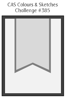
The colors this week for the Splitcoaststampers color challenge are perfect for this die.  I'm not sure why I purchased it - I think because it somehow reminded me of Frida Kahlo.  

The die itself is both easy and tedious to work with.  I didn't have a light brown cardstock for the lines so I inked white cardstock with DO Vintage Photo ink and cut out the pieces.  Because they are so fine I thought this easier than trying to color every piece.  I also used a self-adhesive sheet on the back. Her face is shaded with DO Antique Linen and SU Rococo Rose.  To get some shading on the flowers and her lips I used the matching ink to the cardstock. 

The flowers on the card were a bit tedious.  I cut a lot (too many) and assembled them, leaving off the centers.  I started attaching them across her forehead by just attaching them a bit in the center back, so I could tuck other flowers and leaves underneath until it looked full. Then I went back with a fine tip glue and securely glued them. There is actually a purple flower underneath that you can't even see!

On something like this where placement of the front items is crucial, it is easier for me to glue this way (items on top first) rather than starting with the back.  Starting in the back may mean I have to adjust the front and since this is a face there isn't much room for error without her looking odd.

The last thing I did was add the gem centers to the flowers.

The colors this week are Highland Heather, Pear Pizzazz and Rococo Rose.  I hope you will find time to join us!

  • Stamps: Stampin' Up! Stitched All Around (retired)
  • Dies: Spellbinders Tallulah, SU retired frames
  • Ink: Versafine Black, Rococo Rose, Highland Heather, DO Antique Linen, DO Vintage Photo
  • Paper: Pear Pizzazz, Rococo Rose, Highland Heather, Very Vanilla, White, Subtles DSP (retired)
  • Accessories: SU Elegant Faceted Gems

Thanks for visiting today! Click here to sign up for email notifications of future posts (you will be sent an email to verify your address - don't forget this step).  Follow me on Instagram, Pinterest, Facebook and Bloglovin'.


post signature

8/30/2020

Choclate and Wine

These are a few of my favorite things - chocolate and wine!
I often make cards for color challenges, so when I'm left to my own devises it can be quite challenging (pardon the pun) for me.  Obviously, I needed to use a chocolate and a wine color on this card.  I found this gold foiled curvy tag in my stash and thought that would work to hold the sentiment.  So from there I picked these colors:
The style of this card is a bit different for me but I felt the curves, bow and antiquing fit with the image and theme.

I made this card as part of the Dirty Dozen Alumni design team for this year's Dare to Get Dirty week of challenges at Splitcoaststampers.  There is still time to play along.  Click here for more information.  And you can always check out the gallery of everyone's contributions here.

Edna is my favorite fairy!  I can't wait to color her again!

  • Markers: Stampin' Blends and Copics - Rococo Rose RV000, RV32, RV34; Rose Red Stampin Blends Rococo Rose Light & Dark (these do not look like Rococo Rose to me) R39; Soft Sky BG000, BG10 Pool Party Light; Baja Breeze BG10, BG70, BG72, Pool Party Dark; Merry Merlot Cherry Cobbler Light & DarkR39; Chocolate Chip E23, E25, E27; Other colors used E50, E51, E11; E47; E41, E43; Mossy Meadow Light & Dark
  • Stamps: Stamping Bella Edna Loves Chocolate and Edna the Everything Fairy

Thanks for visiting today! Click here to sign up for email notifications of future posts (you will be sent an email to verify your address - don't forget this step).  Follow me on Instagram, Pinterest, Facebook and Bloglovin'.

post signature

8/27/2020

It's All About Balance

It's time for another Team O challenge at TicTacToe Challenge!  Here is my design team card for the diagonal from the upper left.


I've loved the slimline cards since they first started being shown, but I'm starting to make more of them.  For me, they offer variety in layout.  I have some stamps that are overwhelming on an A2 card but work perfectly on the narrow format. 

The sentiment "balance" needed to be large and the best way to do that was down the side.  I wanted the letters to look like they were balancing on one another.

For this card, I chose my colors based on the paper.  The image is mostly neutrals with only the wrap as any significant color.  I knew I would be placing her over the pattern so I decided on a small unobtrusive one with a variety of colors. The color in this card comes mainly from the sentiment.

That's my card for today - now it's time to go eat a cupcake!

  • Stamp: Stamping Bella Curvy Girl with Good Balance
  • Markers: Stampin' Blends Pool Party Light & Dark, Poppy Parade Light, So Saffron Light; Copic markers BG10, E13, E50, E51, E11, E19, E25, E27, BV20, C00, C0, C1, C3 
  • Prismacolor pencils: 905, 992,923, 927, 939, 997, 1012, 921, 947, 1063, 1065, 1067
  • Cardstock/paper: Stampin' Up! Pool Party, So Saffron, Calypso Coral, Real Red, "I Am Me" patterned paper (retired)

Thanks for visiting today! Click here to sign up for email notifications of future posts (you will be sent an email to verify your address - don't forget this step).  Follow me on Instagram, Pinterest, Facebook and Bloglovin'.

post signature

8/25/2020

A Bike Ride for Challenges

It's Tuesday so that means more challenges at CAS Colours & Sketches and also at Splitcoaststampers.  Since I have a sketch and a color challenge this week I combined them!
I'm the hostess for the color challenge and I gave the extra option to use dots, stripes or checks.  I decided to see if I could use all three - and I did!

So Saffron/Poppy Parade/Pool Party

My post is short today.  It's been a long weekend and Monday.  I think everything is self-explanatory.  I stamped and die cut the bike and accessories which are colored with Stampin Blends markers.  I used an embossing folder for my stripes.  All products are Stampin' Up!  The Bike Ride stamps and dies are retired.

  • Stamps: Bike Ride
  • Dies: Build a Bike, Stitched Nesting Labels
  • Markers: Stampin Blends Poppy Parade, So Saffron, Bronze, Mossy Meadow
  • Ink: Black, Smoky Slate, Pool Party
  • Paper:  Subtles DSP (retired), So Saffron, Whisper White
  • Accessories: Stripes embossing folder

Thanks for visiting today! Click here to sign up for email notifications of future posts (you will be sent an email to verify your address - don't forget this step).  Follow me on Instagram, Pinterest, Facebook and Bloglovin'.


post signature

8/21/2020

Sunshine and Pink

I love the sentiment on this card - probably because I love the sun and I love the color pink!  I used some dies from the new tropical release at Cottage Cutz.  The Tropical bouquet die features two flowers I love; hibiscus and plumeria.  On today's card I used the plumeria.  They are gorgeous, easy to create and add a special touch to any card!
The flamingo and flowers are all cut with various scraps of cardstock and edged with ink for a bit of depth and variety.  For the black pieces, I colored the light pink pieces with black Copic marker.

Using a stencil and yellow ink, I created a sun for under the flamingo on the narrow white panel and stamped the sentiment in the lower left.
.
I added my flamingo, flowers and a few sequins.  Super easy card and perfect for anyone who loves pink, flamingos, flowers or sunshine!

Dies: Cottage Cutz Flamingo with Hibiscus and Tropical Bouquet

Thanks for visiting today! Click here to sign up for email notifications of future posts (you will be sent an email to verify your address - don't forget this step).  Follow me on Instagram, Pinterest, Facebook and Bloglovin'.


post signature

8/18/2020

Blossom Birthday

Since it's Tuesday it's a new challenge at CAS Colours & Sketches!

The color challenge this week:
My card this week was super easy - I blended the Pool Party softly across the card and made a few quick splatters. I stamped the flowers in the Highland Heather and Daffodil Delight and added the die cut outlines and "Happy Birthday".  Finally, for a bit of sparkle I added a few clear dots.

If you don't already have a Stampin' Up! demonstrator I would love to help you with your stamping needs. Place an order with me between now and August 31 and I will send you the new Mini Holiday Catalog!

Stamp and die bundle: Stampin' Up! Blossoms in Bloom Bundle
Dies: Well Written
Ink: Highland Heather, Pool Party, Daffodil Delight
Accessories: Flowers for Every Season Gems

Thanks for visiting today! Click here to sign up for email notifications of future posts (you will be sent an email to verify your address - don't forget this step).  Follow me on Instagram, Pinterest, Facebook and Bloglovin'.


post signature

8/17/2020

A Really Old Stamp is Given New Life - from 1996 to 2020

In keeping with my desire to use some older stamps and update them, I decided to use a very old stamp for this week's color challenge at Splitcoaststampers. It's from 1996!  This is definitely a stamp that looks like it was born in the 80s or 90s.  I remember sewing an apron and Christmas tree skirt printed in this style back then.  But I love the image and it fit so well with this week's colors (Crushed Curry, Cajun Craze and Early Espresso) that I wanted to use her.
How to keep her from looking like 1996?  The current palette and limited colors helped enormously!  Because of the challenge rules, I could add green (Mary, the hostess said to use our favorite green and/or sunflowers).

In trying to update older stamps color is important.  Many older stamps may actually be a current "style" or one that really doesn't go out of style, but when we associate it with colors that HAVE gone out of trend, we think of the set as dated.  Hand-in-hand with color is method of coloring.  I used alcohol based markers and Prismacolor pencils.  The markers back in the day were water based and did not give the ease of blending like today's markers.
Some sets though are of a style that was popular years back.  This one is certainly that.  In order to avoid looking like a circa 2000 card, I made a conscious effort to avoid embellishments that would have been popular at that time and avoid layouts that were trending then.

Previously, I would have layered this card on at least two layers of cardstock.  Why?  As a wood mounted stamp, I probably would not have stamped it straight so I would have cut it out using my paper trimmer.  Then I would have added at least one border.

My Misti (and Stamparatus) have changed the way I stamp.  I can now stamp an image cleanly and straight.  I have remounted numerous stamps to be able to use them in one of these platforms (although not this particular stamp; it's old enough I'm afraid of damaging it in trying to remount it.)

I also used my other game changer - my Scan 'n Cut.  When I stamped this image I did not care about how straight it was because I knew I would use my Scan 'n Cut to cut her out.

You can see that although this is a rectangular image, she does not have a 1/4 to 1/2 inch straight border around her with another border beyond that.  The image itself is cut out and popped up, making it look more like 2020.  That isn't to say that a rectangle with a border looks dated (they certainly don't!), but when the image itself is this dated it is best to try and make everything else as current as possible - layout, embellishments, colors, fonts. Die cut images are what is trending now.

Embellishments and fonts are two things that can also date a card quickly.  Unfortunately, I have a rather large stash of 10 year old (or so) brads that I'm a bit afraid to put on cards.  I'll have to try some out to see if I can update their use!  Here, I used some linen twine and a side border that goes with the feel of the image but is more in keeping with what is seen on a lot of cards today.

Fonts are a pretty big topic and I'll have a post entirely devoted to those!  On this card it was easy to not get caught with a dated font - I didn't use one!

I hope you enjoyed today's card and will try updating an old stamp!  It can be a challenge but it is always fun to bring new life to an old favorite.


  • Stamp: Penny Black Bee Sweet
  • Dies: My Favorite Things Sunflowers
  • Markers: Stampin' Blends Daffodil Delight Light & Dark; Cajun Craze Light & Dark; Old Olive Light & Dark; Copic markers Y26, E02, E55, E57, E59, YG00
  • Prismacolor pencils: 948, 942, 1034

Thanks for visiting today! Click here to sign up for email notifications of future posts (you will be sent an email to verify your address - don't forget this step).  Follow me on Instagram, Pinterest, Facebook and Bloglovin'.

post signature

8/16/2020

It's Too Darn Hot

I've been very busy this weekend making cards for various challenges and upcoming events.  This one is for two challenges whose themes overlapped a bit.

I think this little Scottie has decided that it's just too hot to go chasing after that ball.  I had fun making this a slimline card so the ball could really bounce beyond him and he'd just watch it!

The dog and ball are colored with Copic markers.  I made the ball red even though it looks like a tennis ball, because my little dog has her favorite red ball.

For the background I used Distress Oxide Inks and stencils.  The lawn in cut using a new slimline die from Mama Elephant.

This card is for these challenges:

The Card Concept "Dog Days of Summer."  And.....

CASology "Ball."

I had a great time creating this card.  I would have like for the pup to look a bit more like my dear sweet Penny, but she's a Shorkie so that just wasn't in my stamp collection!

  • Stamps: My Favorite Things Lucky Dog; Lawn Fawn Reveal Wheel Friends and Family Sentiments
  • Dies: MFT Lucky Dog; MFT Clouds (used as stencil); Mama Elephant Creative Cuts Slim Window Dressing
  • Markers: Copic Markers Y13, Y15, Y19, R20, R22, R24, R27, R29, N0, N1, N2, N4, N6, N8
  • Inks: Distress Oxide Mustard Seed, Tumbled Glass
  • Accessories: Fun Stampers Journey Sunny Day Stencil

 Thanks for visiting today! Click here to sign up for email notifications of future posts (you will be sent an email to verify your address - don't forget this step).  Follow me on Instagram, Pinterest, Facebook and Bloglovin'.

post signature

8/14/2020

Beautiful Friendship

I had to share this card using news dies from the Tropical collection at Cottage Cutz.  I LOVE this collection - hibiscus flowers are one of my favorites followed by plumeria.  Both are included!

 
This card was easy to create.  I wanted the flowers to be very organic and fluid so I decided to watercolor my cardstock that I would use to cut the flowers.

I took a piece of Mixed Media paper 6 x 11 and just started watercoloring with three analogous colors - a yellow orange, an orange and a bright pink.  This gave me the color palette I was looking for.

When gluing the flowers to the card, I started with the two main flowers and adhered just their centers.  In this way, I could tuck the leaves behind the flowers.  When everything was on the card, I added glue with my fine-tipped glue.
The small flower is popped up using foam dots.  Some of the leaves were overhanging the edges of the card and I trimmed those using scissors.
Finally, this card seemed to need a bit of sparkle.  I added a few sequins and used a shimmer pen on the small hibiscus flower in the front.
 
  • Dies: Cottage Cutz Hibiscus Flowers, Tropical Bouquet and Sloth 

Thanks for visiting today! Click here to sign up for email notifications of future posts (you will be sent an email to verify your address - don't forget this step).  Follow me on Instagram, Pinterest, Facebook and Bloglovin'.


post signature

8/13/2020

Read Relax Repeat

It's time for another Team O challenge at TicTacToe Challenge!  This challenge is one of my favorites because the Design Team samples are always so varied.  Choosing three elements can send everyone off in totally different directions.

 Stef gave us these fun elements to work with:

Although the theme for the board slants toward back-to-school, you can see my card does not fit that.  I do not have small children or grandchildren and have pretty much NO school themed stamps.  But I did have book stamps.  This Stamping Bella Uptown Girl seemed to fit "read - relax- repeat".  I used the middle row down and tried to give the card the feel of pajamas.  My lace is die cut and I'm proud of the tag.  I made a paper washer and the sentiment tag swings freely from the card!

Rebecca is colored with Copic markers/Stampin Blends and Prismacolor pencils, then cut out with my Scan 'N Cut.  I used Spellbinders dies for the "lace" edge.

  •  Stamps: Stamping Bella Uptown Girl Rebecca Loves to Read, MFT Birdie Brown Our Story
  • Dies: Spellbinders Small Die of the Month May 2020
  • Markers: Stampin' Blends Pink - Pirouette Light & Dark, Soft Sea Foam Light & Dark, Highland Heather Light & Dark: Copic markers - BV0000, E000, E00, E11, E29, E34, E35, N0, N1
  • Prismacolor pencils: PC929, PC928, PC1014, PC956, PC1008, PC1026, PC120, PC289, PC920, PC1089, PC927, PC939, PC997, PC943, PC945, PC946, PC947, PC1050, PC1051, PC1052, PC1054, PC1056, PC1058

Thanks for visiting today! Click here to sign up for email notifications of future posts (you will be sent an email to verify your address - don't forget this step).  Follow me on Instagram, Pinterest, Facebook and Bloglovin'.

post signature

8/11/2020

Bee Unique

Good morning!  It's Tuesday and a new sketch challenge at CAS Coulours and Sketches.  I went super literal on today's card for the sketch.

I used mixed media paper and stamped the background with Bumblebee ink and a hexagon background stamp; then used a paintbrush to watercolor the ink. I left it in my stamping platform when I did this and then restamped it in Cinnamon Cider ink.

The bees are stamped in Memento and colored with Copic markers/Stampin' Blends.  I probably should have made my unique bee a bit more different (I toyed with using blue or red) - I hope you can see that he's orange!  I used a hexagon die to cut them out.

Super easy to create!

  • Stamps: Honey Bee Stamps Busy Bees and Bee-You-Tiful Sentiments, MFT Hexagon background
  • Dies: Honey Cuts, MFT Hexagons
  • Markers: Daffodil Delight Light & Dark, So Saffron Light; Pumpkin Pie Light & Dark, YR01; BG0000, BG000; N3, N5, N9

Thanks for visiting today! Click here to sign up for email notifications of future posts (you will be sent an email to verify your address - don't forget this step).  Follow me on Instagram, Pinterest, Facebook and Bloglovin'.

post signature

8/10/2020

Giving New Life to an Old Stamp Set

I've been cleaning out and reorganizing my stamps.  A while back I had put some stamps in a discard box.  Most were wood mount.  But as I was going through the box I had some second thoughts.  Several were there simply because they were wood mount.  Among those was this two-step stamp set.
This is a set that is a bit dated but I knew I could make it look more modern with the right layout and font.  The butterflies are pretty basic!

This is my first in several posts about some ways that we can use what we have and get new life from older stamps.  I love new things, but it's also important to use items we already have.  I'll talk about things like trends, colors, layouts and fonts.  And what stamps I'll keep forever, and why!  Today, I'm going to focus on remounting wood stamps.

I didn't particularly like two-step wood stamps, but I do like cling and clear two-step stamps; stamping platforms or acrylic blocks make them so much easier to use.  Even with a stamp set like this where you didn't want everything to line up, they were a pain in wood!

To make these stamps cling mount, I used my microwave.  Placing two stamps in it at a time, I heated them on high for 10 seconds.  (If they are large stamps I've gone 15 seconds)  I have an 1100 watt microwave.  I can then gently remove both the rubber stamp and its foam backing and the sticker on the other side.
I place the sticker on the foam side of the stamp.  While everything is still warm, it is all fairly sticky.  That is why I do only two at a time.  Because the stickers on these stamps were rectangular (newer wood mount stamps from Stampin' Up have stickers the shape of the stamp itself) I needed to trim around each stamp.  They're not super pretty this way, but it works!

I then placed a piece of the new cling mount adhesive on the back to make them into cling stamps.  You can also cover the sticker with Tombow glue and let it dry - that makes the back somewhat sticky.
I have a PDF of the slim case insert from Stampin' Up!.  It is an Acrobat document and you can type in the name of the set and even how many stamps are in it.  I then stamped all the images on the front.  I trimmed the case and inserted it into a clear mount stamp case.  You can purchase these in packs of four.

I now have a "new" stamp set complete with punch!  (I haven't figured out how to convert a whale tail punch into the newer flat style yet! LOL!)  And I use the old wood mount stamp case to hold miscellaneous craft supplies.

And a bit about this card - it is for the color challenge this week at Splitcoaststampers - Misty Moonlight, Mango Melody and Granny Apple Green!

I've listed below the stamps and accessories I used.   If you don't already have a Stampin' Up! demonstrator I would love to help you with your stamping needs.

Send me an email if you would like a PDF of the insert.  Please leave a comment about what stamps you'll be converting!

Stamps: Stampin' Up! Flight of the Butterfly (retired), Lovely You (sentiment), Dressed to Impress (dots)
Ink: Mango Melody, Misty Moonlight, Granny Apple Green
Paper: Misty Moonlight, Whisper White Thick
Accessories: Clear Mount Storage CasesCling mount adhesive sheets,  Paper Trimmer,

Thanks for visiting today! Click here to sign up for email notifications of future posts (you will be sent an email to verify your address - don't forget this step).  Follow me on Instagram, Pinterest, Facebook and Bloglovin'.

post signature

8/07/2020

Aloha Friday!

Aloha!  Are you ready for the weekend?  I know I am.  One of the things I miss most in these social distancing/quarantine times is traveling.  I travel frequently to Hawaii on business and by August I've usually made two to three trips to Oahu.  This year - only one.

Cottage Cutz has just released some adorable Beach and Tropical dies.  Today's card features some of my favorite Hawaiian things - pineapple, Hawaiian music and umbrella drinks (make mine a Mai Tai!)
The card is actually quite easy to make but does involve some ink blending.  I wanted to make sure that there was a good variety in my browns and I tend to use the same colors all the time.  So before I undertook the coloring, I organized my Distress Oxide inks to see exactly what I had.  Previously they were all thrown in a drawer!

So....I cut all the pieces in white from the Aloha & Ukulele and the Tropical Fruit dies. Then I used blending brushes and colored them using these Distress Oxide inks:
It may seem like a lot but you'll notice there is overlap in the colors I used on the objects.  It really didn't take long and I love the color depth I got!

I created frames for my objects and adhered them to the front of the card.  Details on all the steps to create the card are on the Cottage Cutz blog today.
Have a great weekend and I'll see you Monday!

Dies: Cottage Cutz Aloha & Ukulele; Tropical Fruit; Stitched Wide Circle Frames
Stencil: MFT Mini Cloud Stencil
Ink: Distress Oxides - see photos

Mahalo for visiting today! Click here to sign up for email notifications of future posts (you will be sent an email to verify your address - don't forget this step).  Follow me on Instagram, Pinterest, Facebook and Bloglovin'.


post signature

8/04/2020

A Posted for You Color Challenge

It's another Tuesday and another color challenge at CAS Colours & Sketches.  This week features some a very soft pinks and a russet along with a green.
I made this note card size - 3 1/2 x 5 inches.  This size is the smallest that can be mailed.  I like it because often I don't want to write a whole lot on the inside of the card.  This allows for a simple "Happy Birthday - Have a wonderful day!" or "Thank you for your kindness, it means so much to me".  Something simple and easy.  I intentionally did not put a sentiment on the front so it can be used for any occasion.

This stamp set is one of those that is very versatile even though it's super simple (probably BECAUSE it's simple).  It has a matching postage stamp rectangle punch which means cards can be made fast.  To get the square stamp I punched out the stamp and then re-punched it to make shorter. The punch has perforation marks which makes it very easy to line up.  I did have to adhere the image end getting cut off to a strip of paper in order for it to reach inside the punch.

The images are stamped in Stazon Black ink and colored using the inks and a blender pen.  Because there isn't much color I could use the Whisper White Thick and not worry about the paper pilling.  If there were a lot of watercoloring I would need to use a paper designed for that.

I also used two layers of green underneath the stamps to add a bit more green to the card.  On the small stamp, the bottom left corner actual has an extra three layers so that it is flush with the rectangular
stamp.

For a bit extra I also stamped the envelope.  I find this is always a nice touch.

I hope you'll join us this week at CC&S!

If you don't already have a Stampin' Up! demonstrator I would love to help you with your stamping needs. Place an order with me between now and August 31 and I will send you the new Mini Holiday Catalog!

To make this stamp and punch even BETTER - there is a coordinating holiday stamp set in the new Mini Catalog!

Stamps/punch: Posted for You Bundle
Accessories: Blender Pens

Thanks for visiting today! Click here to sign up for email notifications of future posts (you will be sent an email to verify your address - don't forget this step).  Follow me on Instagram, Pinterest, Facebook and Bloglovin'.


post signature