8/30/2017

Stampin' Up! Happiest of Days Clean and Simple Card

This is one of those stamp sets that can go unnoticed, but I really do love it.  The images are simple and loose - so your coloring can be as tight or loose as you'd like.  Here I went for something in between.
Clean and simple cards
I made this for both a color and CAS card challenge on Splitcoast Stampers.  The CAS challenge was to make a "sweet" birthday card and the color challenge was to use Bermuda Bay, Lemon Lime Twist and Basic Grey, with the added dessert option of a birthday card.  I love when I can combine challenges!  Challenges are a fun way to create and have at least one parameter settled for you.  If you haven't tried any you should.  They can allow you to focus on some aspect of your card (technique, color, etc) without spending a lot of time on another, and they can also make you think outside the box (like when you think "I would NEVER put those colors together!").

I must say these two challenges didn't force me to think too far out of the box although at first I wasn't sure about the colors.  I ended up loving the Lemon Lime Twist.  After stamping the image, I used an aqua painter to color in the image, going back over the edges with an almost dry brush to give a little shading.

Instead of using foam dots to lift the image off the card I used 5 ovals cut out of Lemon Lime Twist card stock so I had that extra edge to the oval. Finally, I thought it needed just a little something so I added the bow.

This card came together very quickly and would be a great card to make several of so that you have birthday cards on hand.

Stamps - Stampin' Up! Happiest of Days
Ink - SU Bermuda Bay, Lemon Lime Twist, Basic Grey
Paper - SU Shimmery White, Bermuda Bay DSP (retired)
Dies - SU Stitched Shapes

Thanks for  visiting!  Don't forget to sign up for email notifications of new posts and follow me on Facebook, Instagram and Pinterest!

post signature

8/28/2017

Shading Solid Stamps with a MISTI

Good Morning!  I hope you did some fun things this weekend.  I spent it making cards and cleaning house.  One out of two isn't bad.  This card I made for the August 22 sketch challenge at CAS Colours & Sketches challenge blog.  I love clean and simple cards, but the name is a bit misleading.  While the design may be simple, there is usually very little else that is simple about them.  Neatness counts big time in CAS!
CAS stamp placement
The sketch was to use a line of three objects and a sentiment.  When making a line of objects, things need to be very precise on them because there is little else to distract your eye if something is off.  First I cut two pieces of white cardstock to A2 size.  I laid down washi tape where I wanted the bottom of the Tiki cups on one of the pieces.  Then I measured the stamps side to side to decide how far apart to place my stamps.  Thankfully these were an inch wide which made the math a little easier!  I marked the top of the card front with tick marks to indicate the area where I wanted to center my stamps.
CAS stamp placement
You can barely see them on this photo.  In retrospect I would just draw grid lines in pencil. With the MISTI you can so easily make multiple cards (I was planning on making two anyway) that you could use one as your "adjustment" card and then make as many real ones as you want. 

This stamp set has two different Tiki cups so I stamped the first two in Delightful Dijon. Then I took a sponge dauber with Soft Suede ink to the edges of the stamps without cleaning the stamps in between.
CAS stamp placement
This gives a nice shaded and blended edge to the solid stamp.
CAS stamp placement
The MISTI makes this super easy to do.  I've shaded solid stamps without the MISTI by loading the stamp with one color and sponging the edges before doing any stamping, but you have to work really quickly with that method so the ink doesn't dry.  This gives the same effect but you can stamp the base color as many times as you need to get a solid image.  And if you need a bit more shading you can always do that a second time as well. When the first two Tiki cups were done I stamped my third one to the right, but only in the base color.  On a separate sheet I did the shading method and die cut it out.
CAS stamp placement
I used Post-It notes to mask off the cup tops for the straws.  Since that stamp was so small I used a sponge dauber to apply the color.  Applying it directly from the ink pad just got too much ink all over my MISTI lid.  On the third cup I stamped both a straw and umbrella.
CAS stamp placement
I used the same methods for the hibiscus flower and played with different color combinations.

There were several reasons I stamped a cup underneath where I was planning to add my die cut cup. First I could get a precise placement of the Tiki cup and I could see where I needed to stamp the straw and umbrella. And I could place my sentiment right where it needed to be. When I assembled the card I used foam dots to pop up the Tiki cup on the right side off the front of the card. Because I had stamped the cup underneath, I didn't have wiggle room for placing my Tiki cup but in a CAS card you really can't fudge with placement anyway.

I hope you liked my card today.  I've had this fun stamp set for some time and never used it.  As my friends know, I'm always looking for the perfect Mai Tai - somehow this layout and these stamps just seemed to go together!

Stamps and dies - Newton's Nook Tiki Time
Ink - Stampin' Up! Delightful Dijon, Soft Suede, Pumpkin Pie, Melon Mambo, Daffodil Delight, Lemon Lime Twist; MFT Black Licorice Hybrid

Thanks for visiting!  Don't forget to sign up for email notifications of new posts and follow me on Facebook, Instagram and Pinterest!


post signature

8/25/2017

Copic Markers with Prismacolors

Good morning!  It's been a LONG week so today's card is one I created a few months ago. It was colored using both Copic markers and Prismacolor pencils.
I colored the stamp with light markers to give it a "base coat" of the colors I wanted, not really worrying about shading.  This gives a nice boost to the pencils so you don't have to use as many layers.  On this card I chose the papers for the background before I started coloring - see my posts about matching Copics to specific colors.  In this instance, I went with the lightest shade of markers.

One of the really nice things about pencils is that the color you see in the lead is what you get - no chart needed.  With markers there is the cap color and the ink color - not always exactly the same - which is why a chart comes in handy.  So, you don't need a chart with pencils but you do need a good eye for color.  (But know that you can always adjust!)

Thanks for visiting today - I hope you have a wonderful weekend. I'm looking forward to mine!

post signature

8/24/2017

Coloring Pastel Colors with Copic Markers

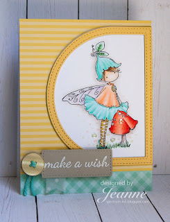
I hope your week is going well.  Mine has been very busy but I wanted to post an extra card today so I could link it for Stamping Bella's Bellarific Friday. Every Friday (and sometimes Sundays) the Stamping Bella blog hosts a challenge - sometimes it is a sketch, sometimes it is color or a photo - it varies.  Last Friday they posted an inspiration photo along with colors.  I chose to use the colors of the macarons as my inspiration.
Coloring Pastel Colors with Copic Markers
The colors reminded me a bit of sherbet and it was tempting to use an image with ice cream.  But I hadn't colored this little girl yet so decided she would look great in soft colors.

The challenging thing about making pastel colors with Copics is that it is very easy to get too dark.  You'll see by my marker list that I used a lot of double, triple and even quadruple zero markers!  And my darkest colors were often threes. But I was able to get good shading even with those light markers.

For those unfamiliar with shading using Copics, a general rule is to pick a light, medium and dark marker and blend those.  Markers whose number ends in zero is lightest, nine is darkest.  So a typical blend might use markers ending in two, five and eight.

Once I finished coloring her I worked on the layout.  I had just purchased the stitched dome frames and they worked perfectly with the asymmetry created by her wing.
Stamping Bella
Being a fairy, she needed LOTS of sparkle so I used several coats of clear Wink of Stella on her wing and the mushroom.  After I added the clear sequins, I still felt it needed something, so I used Nuovo Jewel Drops to give the impression of some fairy dust.  The jewel drops are very light and translucent, other Nuovo drops are more opaque. One thing I love about Nuovo drops - they dry round and even without that little "kiss" top some drops have.

I hope you enjoyed this card.  Supplies are listed below.  (I'm amazed that for a seemingly simple card I used so many products! Aughhh!)

Stamps - Stamping Bella Tiny Townie Fairy Garden and Unicorn Sentiment Set
Copic Markers - Blouse YR000, YR00, YR02; Skirt/hat BG10, BG11, BG53; Tights YR30, Y21, Y23; Leaf/grass G0000,G12,G14; Mushroom R11, R12, R14, R17, E40, E70, E71; Skin E0000, E000, E00, E50; Hair E53, E55, E57; Wing BV0000, BV00; Background Warm Grey 0
Paper - Neenah Solar White, My Favorite Things Homespun Gingham and Dots & Stripes Confection, Stampin' Up! So Saffron and Sahara Sand
Dies - My Favorite Things Tag Builder, Stitched Dome STAX, Stitched Dome Frames
Other - Pretty Pink Posh clear sequins, Nuovo Jewel Drops in Rosewater, Limoncello and Key Lime, Clear Wink of Stella

Thanks for visiting!  Don't forget to sign up for email notifications of new posts and follow me on Facebook!

post signature

8/23/2017

Monochromatic Copic Marker Coloring with Highlights

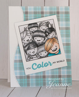
Good Wednesday morning!  Today I have two cards, both made for the same challenge.  I had more fun making these cards than I have had in a long time!  First, the image is just too cute.  And then, the coloring was really enjoyable.  It's been awhile since I've done value drawings so this brought me back to art classes in college and drawing studies.
Value studies, tonal drawing, black and white drawing
This challenge on Splitcoast Stampers was to create a monochromatic card and highlight one item by making it the only thing in color on your card.  (You can see I cheated a bit on my second card.  I'll admit, one reason I made two cards was because I couldn't decide who to feature. Wouldn't it be fun to feature the kid who reminds you of a friend and make them a birthday card?)

Most of my current work is done in color and while I am aware of contrast, it can often be created simply by using another color.  But this card became a study in values - the relative lightness or darkness of the greys.  You don't see many black and white photographs today (remember when all newspapers and most magazines were black and white - color photos were reserved for special articles?) and I think it's harder to visualize in value differences now.  Way back when, I had a professor that made us photocopy color photos and then reproduce them in black and white bumping up the contrast to make them more visually appealing since the contrast in the color version often came from the color.  We learned a lot about value.

So on these cards I started by coloring the hair of one of the monochromatic kids with the intention of working top down, but I quickly realized that I should color my highlighted child first.  I did this so that I could be aware of the contrast between the highlighted kid and the monochromatic bunch. I thought I might not be able to use the colors I wanted for clothing or hair if I colored them last, since I might need to adjust them for contrast and I would rather adjust the grey scale images.
Value studies, tonal drawing, black and white drawing
I decided early on that in the monochromatic kids, it was probably best to do all the hair first, then the skin tones and then the clothing and background.  This way I could be conscious of doing them differently.  I could have used more differences in my skin tones - again easier to do when using your earth tone Copic markers.

On the first card ("Hello") I think I got a bit dark with the background around the girl in red.  It does add some nice depth to the image but it is harder to distinguish her hair from the background.  In the second card, I lightened the background quite a bit.

When putting the first card together, I wanted to lay the photo directly to the page and add washi tape to the top but I also wanted it to have some dimension.  So I made a drop shadow by sponging the background with light grey ink.
I lightly marked where the photo would be and started my sponging in the middle knowing it would be covered up.
Value studies, tonal drawing, black and white drawing
When the photo was put on top all you see is a light drop shadow.

I did use a stitched edge die to cut the edge before I glued the "photo" on and I took the left over piece, rotated it 180 degrees and used it for the border on the other card.

These cards were a blast to make and I hope you try out coloring with your grey markers.  It really makes you think and see things in a new way.

Stamps - Mama Elephant Photo Bomb, Paper Smooches Scripty Sayings (sentiment), MFT Rainbow of Happiness (sentiment)
Ink - Stampin Up! Smoky Slate, MFT Blu Raspberry
Die - MFT Stitched Edge
Paper - Stampin Up! Neutrals DSP, Lawn Fawn Perfectly Plaid Winter
Copic Markers - 
Both - Cool Greys C0-C8
Girl - E000, E00, E04, E11, E23, E27, E29, Y08, Y18, Y26, Y28, R20, R21, R29
Boy - E000, E00, E11,YR20, YR31, YR35, BG02, BG07, BG09

Thanks for visiting!


post signature

8/21/2017

Aloha Card

Aloha everyone!  This morning's card was made for last week's color challenge at CAS Colours & Sketches Challenge.  The colors are Bermuda Bay, Calypso Coral and Crushed Curry and since they remind me of the tropics I decided to go with an Hawaiian theme.
I used Altenew's Totally Tropical stamp set and fussy cut out the flowers.  The flowers are wo step stamped.  I had fun trying out color combinations and it amazed me how many combinations you can get using just three colors.
For the sentiment I wanted to have the "aloha" in the negative space of white layer.  To do this I cut the Aloha from the white layer, then laid the word into the space left by the die, and finally laid out the small pieces in the word. When I lifted the word Aloha out, all pieces were perfectly placed.
You can see from the first photo that I used the coral for the sentiment.  After all was said and done, I didn't like the sentiment in the yellow so I cut it out of the coral and laid it into the negative space creating an inlay of the sentiment.

I used a stencil with light grey ink to create the background.  The angled shapes were created using Blueprint dies from My Favorite Things.

Stamps - Altenew Totally Tropical
Stencil - My Favorite Things Weave
Sentiment - Lawn Fawn Die Aloha
Dies - My Favorite Things  Blueprints 7 & 10
Card stock - Stampin Up! Calypso Coral, Crushed Curry, Bermuda Bay
Ink - Stampin Up! Calypso Coral, Bermuda Bay, Smoky Slate

Thanks for visiting!

post signature

8/18/2017

Enjoy the Journey! Die Cut Card

I love stretching my supplies and using them for purposes other than the original one.  This die called Honeymoon Car is actually for a wedding card and comes with several other elements such as balloons, cans with ties and even silhouettes of the driver and companion!  However I wanted this card to be for an upcoming trip or a card to send to a friend as a memento of a shared trip.
The card is A2 in size.  My first step was to create the car.  I think the hardest part of this card was deciding what color to make the car! I cut all the car pieces from various colors of cardstock, then I used a pink marker to color in the heart on the license plate.
After assembling the car I decided it needed a windshield since I was not using the honeymooners inside.  To do this, I cut a piece of acetate roughly the size I needed, placed it over the back of the car, then drew a cut line with a sharpie.
I adhered it to the car by using snail adhesive on the back of  the car and laying the acetate on that.
I cut a rectangle from black cardstock using the second largest rectangle from the Nested Wacky Stitched Rectangle set.  To get the map the perfect size for centering, I drew a line using the inside of the rectangle as my template.  And by using the rectangle as a frame, I was able to pick just what I wanted showing on the map.  Wouldn't it be great to choose a map of the destination for someone going on a trip?  Or the place you visited with a friend?
I wanted some interest in the background, so I stamped a tone-on-tone wood background on a panel the same size as the front and sponged the edges for a worn look.
I created the compass using various colors of cardstock and then I assembled the card.  The map panel and word are adhered directly to the card.  The car and compass are put on with dimensional foam dots for some depth.

This card was super fun to make and I actually had a difficult time choosing the word.  "Journey", "Explore", "Discover" or "Memories" would all work equally as well.

Dies used - Cottage Cutz Honeymoon Car, Cottage Cutz Compass, Cottage Cutz Wacky Stitched Rectangles, Cottage Cutz Journey Phrase

Thanks for visiting!

post signature

8/16/2017

Using Brusho Powders

Good morning!  Today's card uses Brusho Crystal Colours.  These are intense powdered paints and are fun to use.  The results are always unique and beautiful while the colors are bright and translucent.
Brusho Crystal Colours
I first took a panel of watercolor paper that was slightly larger than an A2 card and sprinkled it with the Brusho powders.  Then I spritzed it with water and let the water run by tilting the paper.  The powders dissolve quickly but you can see in places where it still retains some of the look of being sprinkled and somewhat powder-like.

Because I tend to be impatient, I used a heat gun to dry the paper, leaving it just damp.  At this point I stamped the large butterfly and honeycomb images so the edges would soften due to the moisture.  For the images I wanted clearer, I waited until the panel was dry to stamp.  I tore the edges of the panel for a more organic feel and mounted it to an A2 card.  The small butterfly was punched out and I adhered just the body so I could fold up the wings slightly.

My cards are often very controlled and tight, so the Brushos are a fun medium for me to play with.  They take me out of my comfort zone.  I've posted other cards where I've used Distress inks to create loose backgrounds, but even those are a bit more controlled than the Brushos! 

Stamps - Stampin Up! Butterfly Basics
Inks - Brusho Crystal Colous; Stampin Up! Crushed Curry, Chocolate Chip, Tangelo Twist 
Punch - Stampin Up! Bitty Butterfly punch

Thanks for visiting!

post signature

8/14/2017

Fairy Tale Wishes

This is a card created as a Guest Designer for Cottage Cutz dies.  I love the Wedding Horse & Carriage and Wedding Chapel dies - they remind me of Cinderella! So I wanted to create a birthday card for a girl who loves fairy tales or could be used as a wedding card (just change the "wish" to "celebrate"!)

I cut the cardstock to 8 1/2 x 5 1/2 and scored it at the 4 1/4 mark to make a top folding A2 card.  All pieces except the word "Wish" are cut from the same vanilla cardstock and colored with Copic markers.

I used E37, E39, E47, E49 for the horse and cool greys - C00, C1, C4, C5 - to shade the carriage and wheels.
The chapel was colored with E50 and E 51 and warm greys - W3 and W5 - for the roof. The rose was colored in the same manner using R81, R83, R85 and G82, G94, G99.
To create the horizon line in the background I cut a free form mask using scissors. Then I used a sponge and a few shades of blue and green ink to create the grass and sky.  The white panel is slightly smaller than the front of the card.
I cut another panel out of vanilla cardstock the same size as the card front.  From this I cut an oval using the largest oval die from Basics Oval Set and embossed it to give it some additional interest.
 I played around with the arrangement within the frame and decided to have the steeple of the chapel outside the frame.
The last things added were the word "Wish" and the rose.  I did need to trim one set of leaves off the rose to fit the space.  I also added rhinestones to the center of the wheels.

Dies - Cottage Cutz

Thanks for visiting!

post signature