


I had to be very precise in the addition of the sentiment for it not to look off-kilter. When I had laid out the angles of the two square panels I very lightly marked the top edge of the top panel in pencil on the bottom panel. This allowed me to stamp my sentiment straight; then I glued my top panel just over the marked line. The sentiment was perfectly aligned this way.
I wanted just a hint of color behind the panels. Although I had glued the square panels together I had not yet adhered them to the card. So I outlined them on card stock and cut that out.

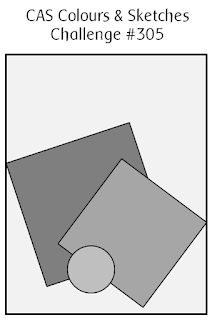
I love working with angles on cards. For one, they add interest. Another bonus is that if you aren't comfortable lining things up, or if you are very particular that everything is straight or even, placing elements at an angle lessens this need for precision. I say "lessens" because you should make sure your angle is enough that it looks deliberate - too little and it may just look "off". And when working with angles, there are decisions on sentiment placement, like here. I toyed with making the sentiment parallel to the bottom of the card but decided it was best aligned at the same angle as the top panel. The mechanics of making that sort of placement happen can be tricky. Overall though, working with angles on your cards is worth the time you spend.
I hope you join us in our fun "angle sketch challenge" at CC&S and our color challenge at Splitcoast Stampers. We'd love to see what you create!
Stamps: MFT Polar Bear Pals
Dies: Cottage Cutz Nested Stitched Squares
Markers: Pool Party Stampin' Up! Blends Pool Party Light & Dark and Copic BG10; Calypso Coral Stampin' Up! Blends Calypso Coral Light & Dark and Copic R01; Coastal Cabana Copic BG10, BG23, BG32; N0, N1, C00, C0, C1, C2, R000
Thanks for visiting today! Click here to sign up for email notifications of future posts (you will be sent an email to verify your address - don't forget this step). Follow me on Instagram, Pinterest, Facebook and Bloglovin'.

I love the colours you have chosen to go with the image. Looks great.
ReplyDeleteGG
I love everything about that card - the colours, the inking in the background, the angles, the adorable bear... Thanks for the inspiration!
ReplyDeleteCindy
I loved the angles of your sketch! Your own card is a beauty...so clean, yet colorful. The shading behind the focal images is truly effective. (Love those bears,too!)
ReplyDeleteThis was a fun sketch, Jeanne! Love the sponging in the background - thanks for showing how you did that.
ReplyDeleteSo cute
ReplyDelete