The Animal Outing stamp set is one of those neglected sets in my stash. I've had it for over a YEAR and am just now starting to use it. (I'm pretty sure I'm not the only one who hordes supplies and doesn't use them.) I'm trying to make a concerted effort to use those supplies. So for the sketch challenge at CAS Colours & Sketches this week I got out my Animal Outing set again. I used it two weeks ago for another sketch challenge on that blog.
Here is the posted sketch:
I altered the sketch slightly (I did not have a die that octagonal shape) and altered the height of the vertical elements.
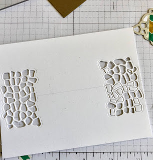
To get my giraffe print in the background I lightly drew a line in pencil at the halfway point of my front panel (A2 size) and die cut the spots on either side, using one of the dies in the Animal Friends set.
I erased the pencil line on the edges, then wrapped a piece of the leaf ribbon and some linen thread around the panel. When I adhered it to a card base of Soft Suede it created the fun spots!
To finish off the card I cut a label shape using the Stitched Nested Label dies. I used my Stamparatus to stamp the fun birthday sentiment "they say it's your birthday" from the Itty Bitty Birthday stamp set on the label. I then fixed it to the card front with Stampin' Dimensionals.
The giraffes themselves are colored with Stampin' Blends and die cut using Animal Friends. I used a tip-to-tip method of coloring with the Mango Melody and Bronze to get the brown of the giraffe spots. This method of touching the lighter color to the darker marker gives you a color somewhere in between. I used the light Gray Granite to add a simple shadow on their necks and chin.
The two giraffes on the sides are glued directly to the Stitched Panel; the one in the center is raised with more Stampin' Dimensionals.
Stamps: Stampin' Up! Animal Outing and Itty Bitty Birthdays
Dies: Stampin' Up! Animal Friends and Stitched Nested Labels
Ink: Stampin' Blends - Mango Melody Light and Dark, Bronze, Gray Granite Light; ink Memento Black,
Paper: Whisper White thick, Soft Suede
Accessories: Linen Thread, Leaf Ribbon, Stamparatus, Stampin' Dimensionals, Mini Stampin' Dimensionals
Full disclsoure - I'm a Stampin' Up! demonstrator and have links to my
demo site above. If you don't have a current demonstrator I would love
to help you with your stamping needs!
Thanks for visiting today! Click here
to sign up for email notifications of future posts (you will be sent an
email to verify your address - don't forget this step). Follow me on
Instagram, Pinterest, Facebook and Bloglovin'.

The color challenge this week at CAS Colours & Sketches originally made me think of a floral image. After some thought I decided to make a simple "Welcome to the neighborhood" card using a set I love from the new Stampin' Up! catalog. It was one of the first sets I ordered because of it's versatility!
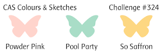
The Colors this week:
This card uses the new "Grandma's House" stamp set. I'm not a Grandma, though many of my friends are or will be, so I know I will use this set for new grandma/new baby events. I love the simple sketched images which can be used for any type of card - that's what makes this set so wonderful! And they are super easy to watercolor. In fact, this type of image looks BEST when colored quickly and without a lot of fuss. For this image I used ink in the lid of the stamp pad and an aqua painter. I added a few neutrals (allowed in color challenges) for the shadows, roof and tree trunks.
The sentiment is from the stamp set "Well Said" and the die from "Well Written". These are carried over from the Occasions catalog for good reason. They are super versatile. With this stamp and die combo you have the perfect sentiment for just about any occasion! Here I use two layers of Gorgeous Grape cardstock under my "welcome" to add just a hint of color.
This week's color are fun to work with - I hope you find time to play along!
Stamps: Stampin' Up! Grandma's House, Well Said
Dies: Stampin' Up! Well Written
Ink: Gorgeous Grape, Calypso Coral, Mossy Meadow, Smoky Slate, Crumb Cake
Accessories: Aqua Painter
Paper: Watercolor, Gorgeous Grape, Magnolia Lane Designer Series Paper
(Full disclsoure - I'm a Stampin' Up! demonstrator and have links to my
demo site above. If you don't have a current demonstrator I would love
to help you with your stamping needs.)
Thanks for visiting today! Click here
to sign up for email notifications of future posts (you will be sent an
email to verify your address - don't forget this step). Follow me on
Instagram, Pinterest, Facebook and Bloglovin'.

I love this pretty, floral unicorn die and found the perfect
sentiment for it in my stash - "Always be yourself (unless you can be a
unicorn)".
I started this card completely opposite of how I usually work. I normally color or make my images and then work on layout. For this one, I had the layout immediately in mind and worked on that first.
After placing the main elements I worked on the other parts of the card. I
colored my leaves in three shades of green and the flowers in various
shades of warm colors. I just chose whatever seemed to go with the
lavender and mint that I had picked. Then I began to randomly layout
and glue the greenery and flowers along the curve that I had cut.
I somewhat lost the curve in the greenery but I'm still pleased with the asymmetrical look. My
final step was to use several coats of Wink of Stella on the horn and
add some rhinestones and pearls interspersed in the flowers and greenery
for a little extra sparkle.
Dies: Cottage Cutz Floral Unicorn
Stamps: Stamping Bella Unicorn Sentiment Set
Ink: Distress Oxide
Card Stock: Stampin' Up! Soft Sea Foam and Purple Posy
Thanks for visiting today! Click here
to sign up for email notifications of future posts (you will be sent an
email to verify your address - don't forget this step). Follow me on
Instagram, Pinterest, Facebook and Bloglovin'.

I have another card that does double duty for challenges - a sketch and color challenge.
Here is the sketch challenge at CAS Colours & Sketches:
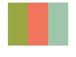
And the color challenge at Splitcoaststampers - Old Olive, Calypso Coral and Mint Macaron:
I struggled a bit at first with the colors; I had a difficult time seeing the mint with the other two. I have maintained for a long time that any color can go with any other color given the right ratio and perhaps a third color, so my challenge was to figure out that mix for these. My original plan was to focus on the coral and olive but as you can see THAT wasn't in the cards. I really like how the coral ended up as the accent color and the mint is front and center. An unexpected choice for me, but one I like.
Stamps: Stampin' Up! Animal Outing and Lilypad Lake
Dies: Stampin' Up! Animal Friends and Layering Circles, MFT Stitched Arch and Arched Frames
Ink: Stampin' Blends - Calypso Coral, Smoky Slate, Old Olive, Ivory; Memento Black, Calypso Coral
Paper: Whisper White thick, Mint Macaron, Garden Lane
(Full disclsoure - I'm a Stampin' Up! demonstrator and have links to my
demo site above. If you don't have a current demonstrator I would love
to help you with your stamping needs.)
Thanks for visiting today! Click here
to sign up for email notifications of future posts (you will be sent an
email to verify your address - don't forget this step). Follow me on
Instagram, Pinterest, Facebook and Bloglovin'.

Hi everyone! I'm back after what seems (to me anyway) forever. I was on vacation and of course did not have time right before I left to schedule any cards. Today's card is for the color challenge at CAS Colours & Sketches and will probably be the card I give to my nephew for his wedding.
The colors this week are:
For this card I used ZIG Kuretake Clean Color Real Brush Pens to get a soft watercolor look. I used a light yellow, pink and blue in colors close to the challenge colors. I also used some neutrals (grey and light browns) for the tuxedo, skin and hair. After stamping the image in waterproof ink, I washed the paper with water and then added my color. I also used an AquaPainter to blend out and soften the colors.
This stamp is from a set from a new-to-me company, Rabbit Hole Designs. I really like their contemporary looking images. So cute and perfect for watercolor!
Stamp: Rabbit Hole Designs Happily Ever After
Ink: MFT Hybrid Black Licorice
Markers: ZIG Kuretake Clean Color Real Brush Pens 302 Haze Blue, 055 Pale Yellow, 201 Pink Haze, 073 Vanilla, 067 Mustard, 064 Oatmeal, 091 Light Gray
Thanks for visiting today! Click here
to sign up for email notifications of future posts (you will be sent an
email to verify your address - don't forget this step). Follow me on
Instagram, Pinterest, Facebook and Bloglovin'.


