5/05/2020

Hope and Joy

Happy Tuesday!  I hope everyone is doing well.  I have two cards today for two color challenges.  The first card is for the color challenge at CAS Colours & Sketches - Pretty Peacock, Terracotta Tile and Purple Posy.  Although these colors are all part of one color suite through Stampin' Up! (the 2019-2021 In-Colors) I admit I had a difficult time figuring out how to use them. I had to fight the urge to add a fourth color - maybe a green or yellow.  That is strictly against the rules in this particular challenge.
I started going through sentiment stamps that I have never or rarely used when I found this one.  I looked for a good bird image and kept finding hummingbird stamps, which would have been perfect to use with the colors except hummingbirds don't sing.  And if I were to use a bird for this sentiment, I thought it should be a songbird.  Then I remembered this feather set and it worked out perfectly!

I stamped the image in Versafine Black Onyx and used the color reinkers to watercolor the image.  I also used a Shimmer Pen to watercolor with and it gave this image A LOT of sparkle.  It really shines when you turn the card.
My next card is for the color challenge at Splitcoaststampers.  There, the colors are Rich Razzleberry, Flirty Flamingo and Crushed Curry.  They are so bright and bold, I went for that look for my card.  The images are die cut and inlaid with papers in the challenge colors.  I had to play with the patterns a bit before I arrived at what paper I wanted to use.  The dots ended up the winner as they were small enough so you could see the pattern and consistent with the style of the dies.  (And notice I added a green in this card.  For this color challenge you may use any SU neutral, which includes Mosssy Meadow1)
For a bit of fun I added a button to the center of one flower (and because I have a bunch of these buttons - LOL!)

I hope you've enjoyed my cards today.  The style of each is very different but also very similar as they are both clean and simple.

Card 1:
Stamps: Simon Says Stamp Earth has Music (feather), Stampendous Hope Sings
Dies: Simon Says Stamp Earth has Music

Card 2:
Stamp: Stampin' Up! Peaceful Moments
Dies: Spellbinders Sketched Blooms

Thanks for visiting today! Click here to sign up for email notifications of future posts (you will be sent an email to verify your address - don't forget this step).  Follow me on Instagram, Pinterest, Facebook and Bloglovin'.

post signature

5/01/2020

Organizing Cardstock in Limited Space

Earlier this week I promised I'd post about organizing your cardstock.  If you are like me you probably have more than you could possibly use in a lifetime and yet that doesn't keep you from buying more!  I use mostly Stampin' Up cardstock and I always keep a good supply of the current colors.  I tell myself - and my husband - that I'm on the Design Teams for two colors challenges so I NEED it!  But I have a lot of retired colors too.

Some demos will get rid of  the old (and that is okay for them) but I just can't. To make things worse, a few years ago I went to a garage sale by a retiring demo.  About the time I arrived her young son started having a melt down and she just wanted everything out of her driveway.  She said I could have it all (five 66 quart tubs of product) for under $200.  So..... I have CARDSTOCK (and ink and stamps and embellishments)!  
I don't have a craft room.  I have a "craft space" in the back of our family den.  All that cardstock has been sitting in my closet hard to get to and rarely used.  Last year I posted how I organized my patterned paper and how it dramatically changed what I used.  When I see something I will use it.  If I can't see it or it's hard to get to, I won't.

This whole project did not take that long.  I did it last weekend in addition to making a few cards.

I decided for this project I would use the same plastic sleeves that I used for my patterned paper.  They are divided into 2 x 2 inch sections.  From each color of cardstock, I cut a  2 x 2 square and wrote its name in the corner.
If I have matching ink, I also noted that on the swatch.  Then I arranged all these in the plastic sleeves in a "rainbow" order.  (More about this later.  You may find it easier if you arrange them alphabetically.)  When colors retire I can adjust how the swatches are in the sleeves.  It is a very adaptable system.

Another wonderful thing about the sleeves as opposed to gluing a swatch to a card, etc. is that I can pull a color out and see how it looks against any other color or pattern.  I have a lot of patterned paper from companies other than Stampin' Up! that are in 6 x 6 inch books.  I am finding that many of the retired colors coordinate beautifully with them. 

This is my notebook.
How do I store my paper?  I have a three drawer file cabinet and believe me, all my cardstock WILL NOT fit!  The top two drawers have the current colors, basics and specialty papers (vellum, X-Press It blending card, some metallics, etc.)  To store, I use box bottom hanging folders with manila file jackets with a 2 inch extension.  You can get these at office supply stores.
They easily hold five packs of cardstock and because of the sides it is all contained. I used my Circle Tab Punch (retiring - available only until June 2, 2020!) to make swatches for the folders and wrote the color names on the bottom of the tabs.
For my retired colors I wrote the name across the circle.  I had too much cardstock for my cabinet but I wanted to be able to easily use my retired colors.  I have about 80 colors in varying amounts of each.  I decided upon approximately one manila file jacket per plastic sleeve of colors; all those tabs would not fit on the manila jacket.  I made a tab for each retired color and glued it to a sheet of thick white cardstock to make dividers.  (I have a lot of this purchased from a big box store, but any color will do if you have excess.)
Then I put several sheets and large scraps behind each divider.  This way I have some on hand to use.  The balance of the sheets I left in their packaging (and for many colors I have two or three packs) that I'm keeping in Bankers Boxes in my closet.  If all the sheets of a color are in the cabinet then I marked that tab with a dot, letting me know that there is no back stock.
When I run out I can go to my closet and pull out some more.  I now only have three stackable boxes.  The empty space in the front of the box on the right will be my extra current colors.  This keeps me from randomly rummaging through my stash in my closet - never a good thing!

For storing my scraps, I use boxes labeled with what is inside.  I don't keep scraps smaller than 2 x 2, and larger scraps (quarter sheet or more) I store with the cardstock - another reason for the folders with sides!  When die cutting or needing a small piece I look through these boxes first.  And if I have  questions about exactly what color the scrap is, I hold it against the color swatches in the notebook.
I always try to go to my scrap boxes first.  In doing this I find I'm using less cardstock.

I'm now working on swatching all my ink.  I have the current ink finished and the swatches in their own sleeves.  I may insert them behind the cardstock swatches to save space but I haven't decided yet.
I like the rainbow order of my cardstock.  Everything is in the same order - the notebook, the cardstock in the Bankers Boxes and the file cabinet.  That way I know exactly where it is.  You could also do this alphabetically.  Either way works!

I know this post is a bit long, but I hope it has given you some ideas about organizing in a small space.   

The Circle Tab Punch is on sale right now and will be retiring in June 2, 2020.  If you would like the Circle Tab Punch please click through for my Stampin' Up! demonstrator website!  The other product I used for this project is the Paper Trimmer.

Thanks for visiting today! Click here to sign up for email notifications of future posts (you will be sent an email to verify your address - don't forget this step).  Follow me on Instagram, Pinterest, Facebook and Bloglovin'.


post signature

4/28/2020

Flower Pot Thank You

It's a two-fer Tuesday for me this week!  The CAS Colours & Sketches blog is having a sketch challenge so I could combine that with the color challenge at Splitcoaststampers.  Which is good because I spent most of my weekend organizing my cardstock!  I'll have a post later this week with what I did and how I did it!  Now for today's card.
The colors are Mango Melody, Poppy Parade and Cajun Craze. And here is the sketch:
I decided to go floral but wanted to stay away from looking like fall.  I toyed with using different sentiments that accentuated the one red flower (like "be yourself" or "you are amazing") but decided that the generic "thanks" was a bit more useful.  I guess I'm a sentiment wimp.  I make more cards than I send so I'm not sure why this was important at the time.  Perhaps because I really like this card and will send it.  It was simple to make and I can easily make more in other colors.
The card is essentially flat for mailing.  I did use foam tape behind the rectangle which makes it stand out, but that doesn't add enough dimension to be concerned about mailing.

Dies: Cottage Cutz Mouse with Garden Wagon, Potted Plants, Stitched Scalloped Rectangles
Stamps: Stampin' Up! Cottage Greetings

Thanks for visiting today! Click here to sign up for email notifications of future posts (you will be sent an email to verify your address - don't forget this step).  Follow me on Instagram, Pinterest, Facebook and Bloglovin'.

post signature

4/23/2020

Bloomin' Pup

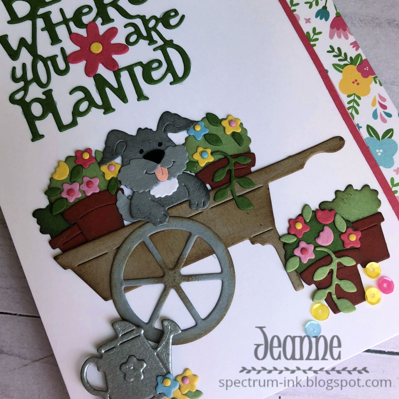
Happy Fridays!  Today I have a clean and simple card featuring dies from Cottage Cutz beautiful new Gardening release.  All the dies are wonderful, but I fell in love with the Puppy in Garden Cart die as soon as I saw it! This little guy poking through the flowers is adorable.

I picked the colors for my card from the patterned paper.  From there it was jsut a matter of cutting enough of the flowers!  And there were a lot! I used Distress Oxide ink in Vintage Photo to edge and shade the cart, pots and greenery.  I used Basic Grey for the pup.

Everything is glued flat on the panel.  When I added the watering can I used a foam dot to pop it up from the card.

I added a few matching sequins near the lower pots and a very thin strip of solid pink cardstock next to the floral strip to finish everything off.

Dies: Cottage Cutz Puppy in Garden Cart, Garden Phrases, Gardening Tomte
Paper: Lawn Fawn Spring Fling
Accessories: Pretty Pink Posh sequins

Thanks for visiting today! Click here to sign up for email notifications of future posts (you will be sent an email to verify your address - don't forget this step).  Follow me on Instagram, Pinterest, Facebook and Bloglovin'.

post signature

4/21/2020

A Nautical Color Challenge

Happy Tuesday.  It's another color challenge at CAS Colours & Sketches blog.  The colors this week are bright and bold!  They reminded me of nautical colors, so I ran with that theme.
The colors this week are Blueberry Bushel, Pineapple Punch and Call Me Clover.
https://cascoloursandsketches.blogspot.com/2020/04/challenge-367-colors.html
I had planned to do some stamping of the images but ultimately used die cuts with only the sentiment stamped.

I stacked the green behind the blue die cuts to give it a little edge.  this was a super quick card to make and perfect for any gender or age.

Stamps: My Favorite Things Go Overboard
Dies: MFT Let's Get Nautical

Thanks for visiting today! Click here to sign up for email notifications of future posts (you will be sent an email to verify your address - don't forget this step).  Follow me on Instagram, Pinterest, Facebook and Bloglovin'.

post signature