3/10/2020

Rain or Shine

Today I am the hostess for two different challenges - the sketch challenge at CAS Colours & Sketches and the color challenge at Splitcoaststampers.  Being the practical (or lazy) person I am, I combined the two challenges.
The challenge colors are Calypso Coral, Daffodil Delight and Seaside Spray.  Below is the sketch:
This stamp set is one of my favorites from Stampin' Up!'s new mini catalog.  I'm not a big fan of umbrella sets but I really like this one.  I think it may be the flowers.  They're quite cute, easy to color and versatile.

I used a mask for the circle and a Mini Cloud stencil along with Seaside Spray ink and sponge daubers to create the sky.  The flowers were colored with combo of Stampin' Blends and Copic markers.

This stamp has a matching punch for the umbrella but not for the flowers.  I colored a BUNCH of the flowers and then used my Scan 'n Cut to cut them out. (I'm not much for fussy cutting).  I now have  a lot left over so look for them in an upcoming card!

I hope you will join us this week at one or both of the challenges!

Stamps: Stampin' Up! Under My Umbrella; Stamping Bella Garden Girl Flower Sentiments
Ink: Stampin' Blends and Copic markers Daffodil Delight Light and Dark,Y11; Calypso Coral Light and Dark, YR00; Mossy Meadow Light and Dark; Seaside Spray dye ink
Accessories: MFT Mini Cloud Stencil; washi tape

Thanks for visiting today! Click here to sign up for email notifications of future posts (you will be sent an email to verify your address - don't forget this step).  Follow me on Instagram, Pinterest, Facebook and Bloglovin'.



post signature

3/03/2020

Lucky for a Friend Like you

Happy March!  Today I start my month as hostess on the CAS Colours & Sketches challenge blog!  For the first challenge of the month I chose some colors that I thought could be used for St Patrick's Day.  Although my card isn't specific to St. Patrick's Day I did want to give it that feel.
The colors for this week's challenge are:
https://cascoloursandsketches.blogspot.com/2020/03/challenge-360-colors.html
Pink and green is one of my favorite colors combinations ever since childhood.  I wasn't sure about the combo of the Shaded Spruce and Soft Sea Foam, but I really love how they look together!

For this card I colored a Stamping Bella stamp with alcohol markers (Stampin' Blends and Copic markers) combined with Prismacolor pencils on top.

I usually color a stamped image very quickly to get an idea of what color I want where in the image.  This time I just needed one try but sometimes I may do this three or four times.  Although it takes a bit of paper, it has saved me numerous times from putting in a lot of coloring effort only to decide I made the wrong color choice.
 This is my colored image (newly stamped, not the one above) with just markers.
After coloring with the markers I added the pencils:
The pencils can really add quite a bit of depth to the image.
I know that there are those who can add just as much detail with the markers alone, but I really enjoy using the pencils and find I have more control.  Slowly building up the color with the pencils is something I find incredibly relaxing! To note though, once you start laying down the pencil, you cannot add more marker, so be sure you are happy with the marker.

Stamps: Stamping Bella Flowery Gnome, My Favorite Things Whimsical Greetings
Markers: Stampin' Blends Shaded Spruce Light & Dark, G00; Stampin' Blends (for the Blushing Bride) Pink Pirouette Light & Dark, RV0000; Stampin' Blends Soft Sea Foam Light & Dark, YG63; E50, E00, E11, T0, T1, T2
Prismacolor Pencils: Shaded Spruce 907, 909, 920, 901; Blushing Bride 928, 1089, white; Soft Sea Foam 928, 1089, white; skin 928, 939; other used Warm Greys 10%, 20%; Cool Greys 50%, 70%, 90%; Black

Thanks for visiting today! Click here to sign up for email notifications of future posts (you will be sent an email to verify your address - don't forget this step).  Follow me on Instagram, Pinterest, Facebook and Bloglovin'.


post signature

2/25/2020

Happy Leap Day - a Few Days Early

It's almost Leap Day so I have a card for that celebrates that day!  I used dies to make this card but you can easily make one of the same theme using stamps.
I used Distress Oxide inks to color the frog and foliage.  For my sentiment, I stamped the happy from a birthday sentiment set and then created the "leap day" using an old small wood mount alphabet set I have.  I rarely use it because it's so hard to get the letters lined up evenly and straight, but for this I stamped each letter at an angle.  Not only did I not have to worry about it being perfect, but the up and down adds to the "leap" theme!

I don't normally use a lot of patterned paper on my cards but this card was a bit dull on a white background.   I think the subtle green added a bit of interest and complements the blue paper of the water.

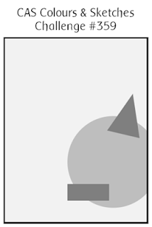
This card is for the sketch challenge this week at CAS Colours & Sketches.  I hope you'll join us this week and submit a card!
https://cascoloursandsketches.blogspot.com/2020/02/challenge-359-sketch.html

Dies: Cottage Cutz Spring Frogs and Stitched Circles
Stamps: Stampendous Happy Messages; Stampabilities Vintage Type Alphabet
Ink: Distress Oxides Forest Moss, Peeled Paint, Shabby Shutters, Gathered Twigs, Scattered Straw, Vintage Photo
Paper: Stampin' Up! Tropical Oasis and Peaceful Poppies

Thanks for visiting today! Click here to sign up for email notifications of future posts (you will be sent an email to verify your address - don't forget this step).  Follow me on Instagram, Pinterest, Facebook and Bloglovin'.


post signature

2/24/2020

Tips for Working with Complex Die Cuts

I fell in love with this die when I first saw it!  It's Spring Blooms from the Cottage Cutz 2020 Spring release.  This is one of those dies that looks incredibly stunning (and intimidating.)  Really - who wants to glue all that together?  It looks great, but....

Well, today I am going to share how I made this card and it was much faster and easier than it looks.
I'll share a few tips and tricks that made it go quite quickly and smoothly.

I decided to use a limited color palette - Rich Razzleberry, Pretty Peacock and Old Olive - the color challenge colors this week at Splitcoaststampers.  By limiting my colors, the choices for all the flowers was dramatically reduced.  But I still wanted more than two colors of flowers.

So, I die cut all the pieces from white cardstock and divided them into three cups - one for each color. 
I colored the white pieces using sponge daubers.  This is much faster than trying to die cut the flowers from different colors of cardstock.
And you can see that by doing this I get variety of pinks, blues and blends giving me more than just two colors.  I also used the blue with the green to give me both light and dark green stems.  (I did cut a few leaves from vellum and two centers from gold foil.)
The next step was to assemble all the flowers.  This could be tedious, but I found an easy way to do this.  I used my silicone mat so nothing would stick to the surface.  (Tip - you can use a silicone baking sheet for this as well.  You won't want to use it for baking afterwards but I know big box stores will sell these in packs of three or four.)
And this is key - instead of trying to place the flowers on the stems, I placed the stems on the flowers.  I left the tiny buds randomly on my sheet and used fine tipped Art Glitter Glue to put a tiny dot on the end of each bud.  Then I moved the stem to each one and picked it up.  Because of the mat, the bud sticks to the stem and not the surface.  When I was done I laid them on the mat to dry.  It went very fast.
Next I worked on the card base.  I cut a panel 4.25 x 5.5 inches and cut two circles using the second and third largest of the Stitched Circle dies.   The larger one is cut from green foil cardstock.
Without gluing them together, I put them on top of each other and laid out some of the flowers to give me an idea of where I wanted my sentiment.  Then I transferred the white circle and sentiment to my stamping platform and stamped the sentiment in black.
After centering the stamped sentiment circle on the foil circle I glued them both to the front panel higher than center leaving enough space for a small floral spray in the lower right corner.

I placed all the pieces where I wanted them, took a photo with my phone so I could remember details and carefully removed the top layer.  Then I started gluing them down.  Having a photo for reference has helped me many times in the past when I forgot where a piece went or at what angle.  I also use my phone if I can't decided between two versions of a layout.  I take a photo of each and can switch between the two to see which I like better.
To complete the card, I used small colored rhinestones for the flower centers rather than tiny die cut circles.

I hope you enjoyed today's card and learned a tip or two on how to make the creative process a bit easier!

Dies:  Cottage Cutz Spring Blooms, Cottage Cutz Stitched Circles
Ink: Rich Razzleberry, Old Olive, Pretty Peacock
Cardstock: Whisper White, Old Olive Noble Peacock Foil Sheet, vellum
Accessories: Noble Peacock Rhinestones

Thanks for visiting today! Click here to sign up for email notifications of future posts (you will be sent an email to verify your address - don't forget this step).  Follow me on Instagram, Pinterest, Facebook and Bloglovin'.


post signature

2/18/2020

Be Still and Listen

Today I'm featuring another card that has Prismacolor pencils over Copic markers.. The image is from one of my favorite new series at Stamping Bella - the Bundle Girls.
This image is for the color challenge this week at CAS Colours & Sketches.
https://cascoloursandsketches.blogspot.com/2020/02/challenge-358-colors.html
I felt the colors worked well with this image.  And it was fairly fast to color as the flowers just needed a bit of shading.  Because the colors are so light it was difficult to get the added touch of shadows needed with only markers.  So I went over the image with pencils.  While the pencils did add depth and smoothness, it is not as evident as in other cards I've colored.  However, I didn't take photos of those and I did this time!  I'll have to remember to take before and after photos again, on an image where it really shows.  This is with just the marker:
And here it is with the pencils on top:
You can see how it added a bit more contrast and smoothed out the shading.

I wasn't sure about the sentiment until I ran across this one.  I had never used it before but it seemed tailor made for this image!  I added the frame in white and stacked three Daffodil Delight frames underneath giving it just a hint of yellow.

Stamps: Stamping Bella Bundle Girl with Flower; Impression Obsession C19088
Cardstock: Whisper White, Daffodil Delight
Ink: Copic markers & Prismacolor pencils (markers are listed first, pencils listed by number only) - Daffodil Delight Y11, Y13, Y15, 916, 1003, 1012; Grapefruit Grove YR00, YR61, YR65, 921, 1001; Pear Pizzazz G20, G40, G43, 912,1096; Skin E00, E01, E11, 997,939;  Dirt E53, E55, E54, 943, 945; Shadows N0, N1, 1065
Accessories: rhinestone

Thanks for visiting today! Click here to sign up for email notifications of future posts (you will be sent an email to verify your address - don't forget this step).  Follow me on Instagram, Pinterest, Facebook and Bloglovin'.

post signature