1/30/2018

Watercolored Floral Heart

Good morning!  Today's card is for this week's challenge on the CAS Colours & Sketches blog.
Because it is the fifth Tuesday of the month, we have a DOUBLE challenge - a sketch and colors!  Here is the challenge that was posted.
I did not have card stock  in all the challenge colors, but I did have ink.  So I decided to make a watercolor wash for the background and also a wash that I could use for die cutting the background of the flower and leaves.
By layering the inks I was able to get variety in my colors.  I added ink, used my heat gun and then added more.  An interesting thing happened - my Apricot Appeal is a bit old and you can see the very solid spot in the middle of the wash.  It acted almost like one of the new Distress Oxide Inks and became somewhat opaque and chalky when it hit the water on the paper.  Odd, but it gave a nice effect.

Please join us at the challenge.  It's quite fun and a good jumpstart for your creativity!

Thanks for visiting today!  Click here to sign up for email notifications of future posts  (you will be sent an email to verify your address - don't forget this step).  Follow me on Facebook, Instagram and Pinterest.


post signature

1/28/2018

Books and Coffee

Good morning!  Today's post a challenge at the Fusion Card Challenge blog.  I just discovered this blog challenge - they give you a sketch and a theme each week.  Participants are allowed to use the sketch or the theme or a combination of both. 
My Favorite Things
The theme this week is Coffee and a Book.  Here is the complete challenge that was posted:
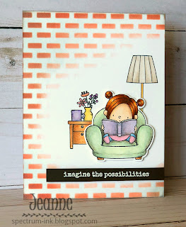
I decided to use the sketch as a base and keep the coffee and book theme.  Two of the design team members used this same stamp set so I felt a bit odd using this set, but I haven't inked it up before now and I just couldn't resist. It was too perfect.

I applied a base coat of color in very light Copic markers, then added  Prismacolor pencils on top.  I blended these with gamsol.  For the main image, I cut her out with the matching die and used foam dots to pop her off of the card.
After I colored the end table and lamp, I used Distress Oxide inks and a brick stencil for the background, using heavier pressure on the outer edge and a lighter touch near the image.

I hope you enjoyed this card today.  It was fun to make but a little challenging.  Though you can't tell, I probably spent as much time with the bricks as with the main elements.  I practiced the stenciling quite a bit to get it just right and in the correct colors.  It is always scary to spend time coloring a project and then start altering it.  I tell myself "it's only paper," and "if I mess up the bricks I can just start again."  But if you do this kind of thing on your cards, you'll understand.

Stamps & Dies: MFT Our Story
Ink: Copic markers and Prismacolor pencils

Thanks for visiting today!  Click here to sign up for email notifications of future posts  (you will be sent an email to verify your address - don't forget this step).  Follow me on Facebook, Instagram and Pinterest.


post signature

1/26/2018

Celebration Cake

Good morning!  I don't know about you, but I can never have too many birthday cards on hand.  And if they are good for either male or female, young or old that's even better.  This card is great for anyone.   It uses mostly dies and a minimum of stamping.  And the stamping is pretty free form so no need to be precise.
I found some patterned paper that reminded me of birthday candles and got my colors from that - Bermuda Bay, Calypso Coral, Daffodil Delight and Night of Navy.  I wanted some fun bright colors.  Then, I used the Layered Cake & Stand die and cut it out of all colors so I could see what combinations I liked for the cake. (And now I have extras for other cards in complementary colors!)
I also die cut the cake stand from silver cardstock and the word "Celebrate"from the navy.  I cut an A2 card base out of white, a strip 1 x 5 1/2 inches from the pattern paper and a strip 1 1/8 x 5 1/2 inches from the navy.  I also die cut two rectangles using the second largest die from the Nested Wacky Stitched rectangles - one white and one Bermuda Bay.
I then stamped confetti on the white die cut rectangle.


I used snail adhesive to attached the pattern paper over my navy strip and then glued it to the left side of the card.  I angled the Bermuda Bay panel on the card and glued the white panel on it but just a little offset to give a "shadow".
My final step was to add the cake, the sentiment and some sequins.

Dies used: Cottage Cutz Layered Cake & Stand, Nested Wacky Stitched Rectangles, Celebration Phrase

Thanks for visiting today!  Click here to sign up for email notifications of future posts  (you will be sent an email to verify your address - don't forget this step).  Follow me on Facebook, Instagram and Pinterest. 

post signature

1/24/2018

Non-traditional Valentine's Card

I thought I'd make a card for Valentine's Day that wasn't so much a Valentine's card as a "you're a great friend".... type card.  I don't know about you, but I just don't have that many people (one hubby, two daughters) that I can send traditional, lovey-dovey type Valentine's to.  However, I DO have a lot of friends that I'd like to say "you're special to me" or "I'm thinking of you" and Valentine's Day offers that opportunity!
Stampin Up
The design and sentiment of this card lends it self to sending to friends. It has the traditional hearts but non-traditional green and pink colors that take it down a notch.  The card is simple to make and takes some time only because you need to let the watercolor wash dry and flatten out.

After I made the watercolor wash background and stamped the hearts I let it dry for a few hours.  Then I adhered it to a card base using Tombow glue and put a shoe box full of dies on it to weigh it down!  I left this overnight and by the next morning my watercolor panel was permanently stuck to the card base.

The main pink heart image was stamped and die cut, then lifted off the card using foam dots.  I used some linen thread in the background to add interest.

I hope you enjoyed this card today.  I have a list of supplies with links to my Stampin' Up! website below.  If you order please use Hostess code 2BQK2KJZ - valid through February 20.  (If you order $150 of products-before tax and shipping-do not use the code so YOU get the hostess benefits.)

When you order $30 of products I'll send you a FREE PDF of project instructions using "Sure Do Love You" and "Heart Happiness" from the new Occasions Catalog.  (If you order "Sure Do Love You" or "Heart of Happiness" stamps I'll also send you detailed instructions on making this card.)

And a $50 order qualifies you to earn a FREE product from the Sale-A-Bration catalog!  Details here.

Stamps: Sure Do Love You, Heart Happiness, Ribbon of Courage
Dies: Lots to Love Box Framelit Dies
Bundle: Sure Do Love You Bundle (includes Sure Do Love You stamps and the Lots to Love dies)
Inks: Sweet Sugarplum, Fresh Fig, Lemon Lime Twist, Pear Pizzazz, Wild Wasabi, Old Olive
Paper: Watercolor Paper
Accessories: Linen Thread

Thanks for visiting today!  Click here to sign up for email notifications of future posts  (you will be sent an email to verify your address - don't forget this step).  Follow me on Facebook, Instagram and Pinterest.

post signature

1/23/2018

Hug and Kisses

Good morning!  It's Tuesday, so it's another card for the CAS Colours & Sketches challenge blog.  This week's challenge is a sketch - which I love!  Here is my card:
Copic marker coloring
 And this is the sketch that is posted:
The circle behind the girl is stenciled using slightly heavier pressure in the center.  To get the circle of hearts, I cut a circle from computer paper and used that to mask off the stencil of hearts. (The dark purple is simply so you can see the mask I cut.)
 This is a simple way to create a soft background.

I usually color two images at the same time (just in case...) - and this time I was lucky that both turned out.  So I made two cards that were slightly different in design. 
Copc marker coloring
I hope you enjoyed today's card.  We would love to see your interpretation of the sketch - please join us this week and enter your card!

Stamps: My Favorite Things Blowing Kisses, From the Heart
Dies: Lawn Fawn Scripty XOXO
Stencil: Full of Heart
Ink: Stampin' Up! Powder Pink
Copic Markers: R000, R00, R20, R21, R23, R24, R27, R29, E000, E00, E11, E23, E21, E29, N1


Thanks for visiting today!  Click here to sign up for email notifications of future posts  (you will be sent an email to verify your address - don't forget this step).  Follow me on Facebook, Instagram and Pinterest.


post signature

1/22/2018

Another Magical Day

It's another magical day here at Spectrum Ink!  This may be my favorite (okay...it IS my favorite) stamp set in the new Occasions Catalog.
If you follow my blog you'll recognize some themes - mermaids, dragons.  This set has those PLUS a knight, wizard and unicorn.  How fun is that!?!  Since it's pure fantasy you can color these anyway you want!

I designed today's card for the Inspiration Challenge for January 13 on Splitcoast Stampers.  For this challenge you were given a website (Uncommon Goods) and asked to make a card based on something from that site.  Here is my inspiration:
Good thing I don't have small children anymore or I'd be buying a castle!  I tried to have the same graphic feel and colors on my card so I used some retired Stampin' Up colors and I color matched the knight and dragon using my Copic markers.

Coloring the knight and dragon was straightforward since I did not want to shade any colors; just keep them flat and graphic.  This is harder than it sounds with Copics.  Since they are transparent you easily get natural shading lines when coloring.  I went over each color twice and tried not to overlap in order to get a flat, unshaded color.  From a normal viewing distance they look pretty good.  Up close, you can see slight variation.

I used a stencil and sponge dauber with various ink colors to make the bricks.  Since I only needed a few bricks here and there, I used paper to mask off the area to be inked.
The process took awhile but was worth it.  I used the Triple Banner and Circle punches to create the pennant along with the crown from the Tabs for Everything stamp set.  The finished card:

I drew stripes on the dragon using a multi-liner pen to match the one on the website.  This card was so enjoyable to make.  I probably would have used different colors (for the dragon at least) had this not been for the inspiration challenge.  But I really wanted to keep this with the feel of the adorable toy castle.

Of course, while I was creating this I kept thinking of other ideas using this set.  Keep an eye out as I will continue to post more cards using it.

I hope you enjoyed this card today.  I have a list of supplies with links to my Stampin' Up! website below.  If you order please use Hostess code 2BQK2KJZ - valid through February 20.  (If you order $150 of products-before tax and shipping-do not use the code so YOU get the hostess benefits.)

When you order $30 of products I'll send you a FREE PDF of project instructions using "Sure Do Love You" and "Heart Happiness" from the new Occasions Catalog.  And a $50 order qualifies you to earn a FREE product from the Sale-A-Bration catalog!  Details here.


Stamps and Dies: Magical Day Bundle
Stamps: Tabs for Everything
Punches: Triple Banner Punch1 inch Circle Punch, 1 1/4 inch Circle Punch
Ink: Smoky Slate, Crisp Cantaloupe, Bashful Blue, Midnight Muse
Mask: Pattern Party Decorative Mask
Copic markers: B41,B99, V15, V17, Y35, YR27, YR65, E50, T2


Thanks for visiting today!  Click here to sign up for email notifications of future posts  (you will be sent an email to verify your address - don't forget this step).  Follow me on Facebook, Instagram and Pinterest.

Have a Magical Day!!!


  post signature

1/19/2018

Kitty Valentine (or Andreya's Card)

Happy Friday!  I love this sweet kitty die probably because she reminds me of my sweet, old grey kitty, Andreya. (Actually Andreya is my daugher's cat but I like to think f her as mine.)
I started with an A2 (5 1/2 x 4 1/4 inch) card base in Real Red, a piece of patterned paper cut to 5 3/8 x 4 1/8 inches and a heart die cut using the largest of the Stitched Hearts dies.
Next, I cut out the cat and small heart using the patterned paper and two shades of grey - Basic Grey and Smoky Slate.
I used Smoky Slate ink and a sponge dauber to add some depth to the edges.  I colored the ears pink and nose black using Copic markers.  Then I assembled the cat.
I put an  adhesive sheet on the back of the red cardstock and die cut the sentiment.
Finally, I assembled the card.  Since the sentiment die also cut out a little red bow, I thought that would be the perfect finishing touch for my sweet kitty.  You can see it in the final card.
A super easy, fast card that goes together quickly.

Dies used: Cottage Cutz Kitty with Spring Chicks, Stitched Hearts, Love Hearts, Sending Hugs Bear

Thanks for visiting today!  Follow me on Facebook, Pinterest and Instagram.  Click here to sign up for email notifications of future posts!


post signature

1/16/2018

Color Challenge (Challenging!)

My card today is for this week's color challenge at CAS Colours & Sketches challenge blog.  And while I love the colors, they proved to be quite challenging for me.  I just couldn't make up my mind how to use them.
Stampin' Up! Petal Palette
The challenge colors this week are:
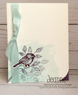
There were quite a few choices - floral, winter/snowflakes...  I finally decided upon this image.  It's so sweet and lends itself to watercolor (which I love!)
I made a wash of the the Soft Sky and then stamped the dots and foliage over that.  The bird was stamped first in the Wisteria Wonder and I used a paintbrush to shade it.  I then stamped over it with the Perfect Plum.  To finish the card I added a ribbon and sequins.

Here are the supplies I used.  (Please use Hostess code 2BQK2KJZ when placing an order. If you order $150 of products-before tax and shipping-do not use the code so YOU get the hostess benefits.)

Stamps and dies: Petal Palette Bundle
Inks: Perfect Plum, Soft Sky, Wisteria Wonder
Cardstock: Perfect Plum


Thanks for visiting today!  Follow me on Facebook, Pinterest and Instagram.  Click here to sign up for email notifications of future posts!


post signature

1/15/2018

Variations in Using a Card Sketch

Today's card starts from a single card sketch.  There was a discussion this weekend in a Facebook group I belong to about using card sketches.  They can be super helpful both when you're in a hurry but also as a starting point for making several cards.  I'm a member of the CAS Colours & Sketches challenge blog and it is always interesting to see how everyone interprets the same sketch. You might think the cards would look monotonous but they don't!
Lemon Builder
All three cards here originated from the same sketch on Splitcoast Stampers. The one on the top right I made first and the one at the bottom I did last.  I also rotated the sketch in the lower one.  Here is the sketch that was posted:
The first one I made was pretty straightforward - two panels of patterned paper and images stamped and punched out using the coordinating punch.  The second one adhered more directly to the sketch - I kept the square and used an embossing folder on the long white panel.  All have the central panel and a focal point, but only one uses the square shown the sketch.
The third one was actually the most work and varies most from the sketch.  I kept the off-center panel, but my focal point (the grapefruit) is not as large as the one in the sketch. I made the fruit patterned paper by stamping and masking.  There is a very similar paper in the Tutti-Frutti cardstock pack that could easily be substituted.  The green stripe could also be substituted with the green check from the same pack (if you only wanted to use one pack of patterned paper.)
I finished off the cards with baker's twine, linen thread or ribbon and some enamel dots.  All cards are birthday cards and say either "live it with zest" or "squeeze it for all it's worth" and Happy Birthday on the inside.This stamp set has some really cute sentiments in it.

I hope this shows how easily you can use a sketch as a starting point for multiple cards.  I love using them when I just can't seem to make a decision on layout or I need to make a card quickly.  I have several layouts that are my "go to" layouts.  Finally, entering sketch challenges are a fun to see how differently others see the same thing - I encourage you to enter them!


Below is a list of supplies I used with links to my Stampin' Up! website below.  If you order please use Hostess code 2BQK2KJZ - valid through February 20.  (If you order $150 of products-before tax and shipping-do not use the code so YOU get the hostess benefits.)

When you order $30 of products I'll send you a FREE PDF of project instructions using "Sure Do Love You" and "Heart Happiness" from the new Occasions Catalog.  And a $50 order qualifies you to earn a FREE product from the Sale-A-Bration catalog!  Details here.

Lemon Builder Bundle
Stitched Shapes Framelits
1 3/4 inch Circle Punch
Layered Leaves Embossing Folder
Cardstock: Whisper White, Pear Pizzazz, Flirty Flamingo
Tutti-Frutti Cardstock pack
Coffee Break Designer Series Paper

Inks: Daffodil Delight, Pear Pizzazz, Old Olive, Lemon Lime Twist, Basic Black, Flirty Flamingo
Ribbon/Twine: Flirty Flamingo Grosgrain ribbon, Linen Thread, Basic Black Baker's Twine
Glitter Enamel Dots
Glitter and Clear Epoxy Shapes
Tutti-Frutti Cards & Envelopes (FREE with a $50 purchase)

Thanks for visiting today!  Follow me on Facebook, Pinterest and Instagram.  Click here to sign up for email notifications of future posts!

post signature

1/12/2018

Design Decisions - Mixing Patterns

Happy Friday!  I wanted to bring some sunshine to winter so I thought a bouquet of flowers would be nice.  Today I'd like to discuss how to choose patterns when using more than one on a card or to coordinate with your focal point.  You can really make your cards shine when the elements look well thought out. 
design decisions
For many of my cards, I have a general idea of what I want to create but pick colors based upon one element.  In this case I knew I wanted to use this paper, so I picked the flower colors based on that.  This paper came in a large pack of coordinating prints.  When using paper sold like that it is easy to use a few patterns together without much thought since they "are meant to go together."

Choosing patterns can be a little tricky - it is much more than making colors match.  It is about color, and scale, and style, and contrast versus similarity (tip - you need a little bit of both!).

For this card I had two papers of the same pattern but the scale was different.  One had small flowers about the size of those in the bouquet and the other was larger (shown here.) I felt the larger one worked better as it contrasted the scale of the focal flowers, but was not so large that they overwhelmed those flowers.  Keep scale in mind.  The scale gives contrast here, the colors lend similarity.

The card needed some color down the side.  It would have been very easy to add a strip of plain card stock or a piece of ribbon.  However this washi tape adds a bit of shine and color, along with a cottage chic look.  The tape works because there is some similarity (in the color and style - cottage chic), but also contrast (in the pattern).  The floral is very loose and organic in contrast to the geometric pattern of the chevrons.  The scale of the chevrons also complements the floral.

Geometric patterns - dots, stripes, checkerboards, etc. - are wonderful to use, especially when paired with something loose and organic. 

A pattern's style should also be considered when choosing it.  Does it complement your image or detract from it?  Be aware of using styles that have no relation to one another.  Here the main flowers aren't particularly realistic or "cartoony", so finding a pattern that complemented them wasn't difficult.  This card would look quite different if the background was filled with Victorian realistic roses while the bouquet of flowers was doodled line art.  Even if the colors were the same, it probably would not work as well.

There are no hard and fast rules, just considerations.  I've seen combinations work often because of a third element or pattern that pulls everything together.  My daughter is the queen of doing this with clothing - we all know someone like that.  No matter what they wear, they look stylish.  Cards can be a lot like that.

When choosing paper/patterns ask yourself - Does this detract from my focal point?  Are you only seeing the pattern paper?  Is there contrast and similarity in patterns or between the pattern and main image?  Do the elements on the card blend without being monotone? Is there a relationship between elements?  What is the common thread among elements?

I hope you learned something today to make some of your design decisions easier or least more thought out.

If you have questions please send me an email or leave a comment below.  I'd love to hear from you.

Dies: Cottage Cutz Flower Bouquet Jar 
Paper: Craft Smith Oooh La La
Washi Tape: Recollections
Inks: Distress Oxides

Thanks for visiting today!  Follow me on Facebook, Pinterest and Instagram.  Click here to sign up for email notifications of future posts!


post signature

1/10/2018

Watercolor Pencil Techniques - Part 3

Hi everyone!  Today I'm sharing another card using the stamp set Friendship's Sweetest Thoughts and watercolor pencils.  Have I mentioned how much I love this set?
Stampin' Up! Friendship's Sweetest Thoughts
The style of it is perfect for watercolor.  When choosing how to color an image giving some thought to the natural style of the art is important.  I love using alcohol markers, and they can be used loosely, but my style of coloring with them is much more controlled and precise - probably not the best way to color the images in this stamp set. For me, this set calls for a loose, quick style and watercolor is a good fit.
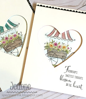
When coloring this image I opted to use a blender pen and Shimmery white card stock as opposed to a brush, water and mixed media or watercolor paper. To get the shadows in the cart top I shaded it in the middle by pressing heavier with my color and also adding some grey pencil.  You can see I also added a little grey to shade the ruffle trim.  When using blender pen to mix two colors it's best to go from the lighter into the darker shade/color.  This keeps the darker shade where it should be.  If you pull the dark into the lighter shade sometimes you end up with not much color where you want it dark and all your color where you want it light!

To get the background sky use a very light touch with the pencil  just next to the image and then use the blender pen to soften it out.  The same with the foliage between the flowers.  I used a light touch with my green pencil and even added a little brown near the cart for depth.  When I blended it out with the pen it gave it a nice soft feel and depth.


I decided to highlight the cart with a heart shape window based on the sentiment.  I could have used dimensional foam dots or tape to pop the front off of the back of the card base, but I wanted to add a little something extra.  So I cut three pieces of Bermuda Bay the same size as the front and using the top panel as a template I die cut a heart in each of the colored pieces and glued them together.  For my card with the pink topped cart I used Flirty Flamingo.

I used a bit of washi tape to accent the card front and then adhered it to the colored stack.  I did need to take scissors and hand trim a bit off of some sides. When doing this technique it is more important to get the window lined up rather than the outside of the card!
The stacked card stock gives a very pretty little bit of color to the shaped window.

Here are the supplies I used.  (Please use Hostess code 2BQK2KJZ when placing an order. If you order $150 of products-before tax and shipping-do not use the code so YOU get the hostess benefits.)

Stamps - Stampin' Up! Friendship's Sweetest Thoughts
Stampin' Up! Watercolor Pencils
Stampin' Up! Blender Pens
Sweet and Sassy Heart Framelits  
Pick a Pattern Washi Tape 
Shimmery White Card Stock
Bermuda Bay Card Stock, Flirty Flamingo Card Stock
Basic Black Archival Ink

Thanks for visiting today!  Follow me on Facebook, Pinterest and Instagram.  Click here to sign up for email notifications of future posts!


post signature