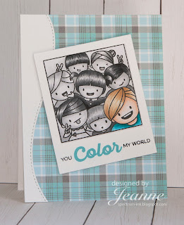
This challenge on Splitcoast Stampers was to create a monochromatic card and highlight one item by making it the only thing in color on your card. (You can see I cheated a bit on my second card. I'll admit, one reason I made two cards was because I couldn't decide who to feature. Wouldn't it be fun to feature the kid who reminds you of a friend and make them a birthday card?)
Most of my current work is done in color and while I am aware of contrast, it can often be created simply by using another color. But this card became a study in values - the relative lightness or darkness of the greys. You don't see many black and white photographs today (remember when all newspapers and most magazines were black and white - color photos were reserved for special articles?) and I think it's harder to visualize in value differences now. Way back when, I had a professor that made us photocopy color photos and then reproduce them in black and white bumping up the contrast to make them more visually appealing since the contrast in the color version often came from the color. We learned a lot about value.
So on these cards I started by coloring the hair of one of the monochromatic kids with the intention of working top down, but I quickly realized that I should color my highlighted child first. I did this so that I could be aware of the contrast between the highlighted kid and the monochromatic bunch. I thought I might not be able to use the colors I wanted for clothing or hair if I colored them last, since I might need to adjust them for contrast and I would rather adjust the grey scale images.
I decided early on that in the monochromatic kids, it was probably best to do all the hair first, then the skin tones and then the clothing and background. This way I could be conscious of doing them differently. I could have used more differences in my skin tones - again easier to do when using your earth tone Copic markers.
On the first card ("Hello") I think I got a bit dark with the background around the girl in red. It does add some nice depth to the image but it is harder to distinguish her hair from the background. In the second card, I lightened the background quite a bit.
When putting the first card together, I wanted to lay the photo directly to the page and add washi tape to the top but I also wanted it to have some dimension. So I made a drop shadow by sponging the background with light grey ink.
I lightly marked where the photo would be and started my sponging in the middle knowing it would be covered up.
When the photo was put on top all you see is a light drop shadow.
I did use a stitched edge die to cut the edge before I glued the "photo" on and I took the left over piece, rotated it 180 degrees and used it for the border on the other card.
These cards were a blast to make and I hope you try out coloring with your grey markers. It really makes you think and see things in a new way.
Stamps - Mama Elephant Photo Bomb, Paper Smooches Scripty Sayings (sentiment), MFT Rainbow of Happiness (sentiment)
Ink - Stampin Up! Smoky Slate, MFT Blu Raspberry
Die - MFT Stitched Edge
Paper - Stampin Up! Neutrals DSP, Lawn Fawn Perfectly Plaid Winter
Copic Markers -
Both - Cool Greys C0-C8
Girl - E000, E00, E04, E11, E23, E27, E29, Y08, Y18, Y26, Y28, R20, R21, R29
Boy - E000, E00, E11,YR20, YR31, YR35, BG02, BG07, BG09
Thanks for visiting!


No comments:
Post a Comment