6/30/2020

Timeless Tuesday Double Challenge Card

Today is the fifth Tuesday of the month and at CAS Colours & Sketches it means we have a double challenge - both sketch and colors.  The sketch is always one that was used previously and the colors are all retired Stampin' Up! colors.
I like these challenges because I find it fun to revisit old colors even though there really is nothing from stopping me from using them now.  But like so many things, when something new comes along I gravitate towards it.

This week the colors are Blush Blossom, Certainly Celery and Bashful Blue.  I used the current Bloom and Grow stamp and die set along with the Parisian Flourish embossing folder.  The image is watercolored using the reinkers. This did take a little while as I wanted some depth and shading so I layered the colors.  This requires that the colors dry between applications.  I used a very light brown ink for the stamp and was considering restamping the image once colored (I used my Stamparatus) but decided against this as I liked the soft look without sharp lines.  I list substitute colors below which are currently available and are close to the challenge colors.

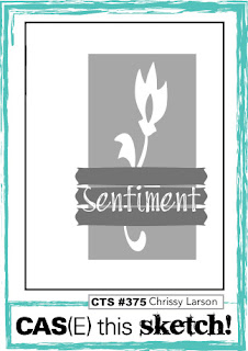
Here is the challenge:

Inks: Blush Blossom - retired, substitute color Petal Pink; Certainly Celery - retired, substitute color Pear Pizzazz; Bashful Blue - retired, substitute colors Balmy Blue or Seaside Spray
Cardstock: Whisper White Thick, Certainly Celery - retired, substitute Pear Pizzazz

Thanks for visiting today! Click here to sign up for email notifications of future posts (you will be sent an email to verify your address - don't forget this step).  Follow me on Instagram, Pinterest, Facebook and Bloglovin'.


post signature

6/29/2020

Peace, Love and Coloring

Good evening! I told myself I would not buy so many stamps this year and the ones I did buy I would make a sincere attempt to use them right away.  I'm not doing the best on this resolution, however this card uses two new stamps and I'm using them within a month of receipt.  I'm feeling good about that!  I had tons of fun coloring her; I think I may do the same card in Christmas colors - wouldn't that sentiment be perfect for the holidays?
This version is for the color challenge at Splitcoaststampers this week - Gorgeous Grape, Bermuda Bay and Pacific Point.  I admit to a little cheating - the smiley face on her shoe shouldn't be in a non-challenge, non-neutral color.  But if you remember when happy faces came out in the 60s you'll remember they were only yellow, so.....I needed to be accurate.

She is colored in Copic markers and Prismacolor pencils.  Here she is in rough layout and before the pencils.
I hope you'll find time to join us this week at Splitcoaststampers for the color challenge!

Stamps: Stamping Bella Oddball Hippe and Good Vibes Sentiment
Inks: Copic markers and Prismacolor (PC #s) Gorgeous Grape V000,V12, V15, V17, PC932, PC1008, PC1026; Bermuda Bay BG10, BG11, BG45, BG49, PC905, PC 992; Pacific Point B00, B02, B05, B06, PC1024, PC1040, PC 103; Skin E50, E51, E11; Hair  E53, E35, E3, E29, PC943, PC945, PC946, PC947; Shoes E30, E31, E33, E35 PC939, PC997; Other C00, C01, C02, C03, PC1065
Dies: MFT Stitched Scallop Basic Edges 2

Thanks for visiting today! Click here to sign up for email notifications of future posts (you will be sent an email to verify your address - don't forget this step).  Follow me on Instagram, Pinterest, Facebook and Bloglovin'.


post signature

6/24/2020

A Quick Card with Pampered Pets

I have a very quick card today with the Pampered Pets set from Stampin' Up!  I like the stamps in the set and I LOVE the paper.  I'm not really a patterned paper person - I definitely use them more as accents - but I'm going to try using the paper as the main focus on later cards.  This paper pack has some great designs!  Stay tuned!
The paper design is very graphic but the stamp set has a more sketchy feel.  In keeping with that I used watercolor pencils to loosely color the dog and bowl.  I'm pleased with how the dog came out but not as much with the bowl.  Watercolor (at least for me) is one of those things you just keep doing until you get it right.  I can't control it like I can my markers; it comes out different every time.  Ultimately, I liked the bowl enough to use the card.  Part of doing loose coloring is embracing the imperfections!

The layout here is simple and the card went super fast.  Less than 45 minutes.

Here are the supplies I used:

Stamps: Stampin' Up! Pampered Pets
Paper: Watercolor or use Shimmery White, Playful Pets Designer Series Paper
Accessories: Watercolor pencils, Playful Pets trim combo, Playful Pets trinkets
Playful Pets Suite (stamps, dies, DSP, trim and trinkets!), Playful Pets Bundle (stamps & dies only)
The stamps and dies are 10% off when purchased as part of the suite or bundle!


Thanks for visiting today! Click here to sign up for email notifications of future posts (you will be sent an email to verify your address - don't forget this step).  Follow me on Instagram, Pinterest, Facebook and Bloglovin'.

post signature

6/23/2020

A Fabulous Floral Card

Today's card is for the sketch challenge at CAS Colours & Sketches this week.
The sketch posted:
The sketch this week perplexed me at first.  I tried a few things before landing on this card.  I masked off the stripes and stamped the foliage.  Then I stamped and die cut the rose.  The sentiment is hot foiled to the card.  (LOVE the Spellbinders Glimmer System!)

This stamp set is a three step set and it did take me some trial and error to come up with a color combo for the rose that I liked with the greens I used in this layout.

Stamps: All Things Fabulous Bundle, All Things Fabulous (stamps only)
Dies: Fabulous Florals (dies only), Stitched Rectangles
Ink: Old Olive, Pear Pizzazz, Mossy Meadow, Just Jade, Bumblebee, Poppy Parade, Real Red, Cherry Cobbler

Thanks for visiting today! Click here to sign up for email notifications of future posts (you will be sent an email to verify your address - don't forget this step).  Follow me on Instagram, Pinterest, Facebook and Bloglovin'.


post signature

6/22/2020

You're my Gnomie

Gnomes are everywhere these days (or so it seems) and while I really didn't need a new stamp set featuring them, I couldn't resist this one from My Favorite Things.
I colored this for the color challenge this week at Splitcoaststampers.  The colors are Tranquil Tide, Berry Burst, Terracotta Tile and So Saffron.  I had a few images in the running for my card but ultimately decided on this one because I thought the coloring would go a bit faster than another I had picked out.

I masked this to combine two images (the gnome and house) and used my Scan 'n Cut to to cut it out.

It is mostly Copic markers; I added just a touch of pencils to a few spots for definition. My panel behind the house is blended using brushes with the Saffron and Berry.  I used Birch tree die cuts to make a small forest.  This set is adorable and to make things even better it comes with gnome puns.  I can't wait to make more cards with it!

Stamps: Hanging with My Gnomies
Dies: Scan 'n Cut, Cottage Cutz Stitched Squares, Stitched Rectangles and Polar Bears w/Birch Trees, MFT Stitched Square Frames
Ink: So Saffron, Berry Burst, Tranquil Tide,  Memento Black, Sahara Sand
Paper: Whisper White, So Saffron, Terracotta Tile, Berry Burst
Markers: Copics and Stampin' Blends - Tranquil Tide BG70, BG72, BG75, BG78; So Saffron Light & Dark, YR30; Berry Burst RV13, RV17, RV19; Terracotta Tile Calypso Coral Light & Dark, R02; Door E33, E35, E37; House W00, W0, W01, W02, W03; Stones N0, N1, N3; Skin & Hair E00, E11, E50, E35, E37, E39; Mossy Meadow Ligh & Dark
Prismacolor Pencils: PC1070, PC1072, PC1074, PC1032, PC1033, PC 947, PC943, PC1027, PC 105, PC140

Thanks for visiting today! Click here to sign up for email notifications of future posts (you will be sent an email to verify your address - don't forget this step).  Follow me on Instagram, Pinterest, Facebook and Bloglovin'.

post signature

6/19/2020

Adulting is Hard

Today's card features one of the other "C"s from Stampin' Up!'s new set Nothing's Better Than.  This time the "C" is for Cocktails!
I think we all feel this way sometimes.  I entered this card in the Tic Tac Toe challenge for this week - middle row across - pink, twine and gold.
I'm having so much fun with this set!  The style just begs for CAS and fun colors!  To go with the tropical cocktail, I added some fun flowers from In the Tropics.  I used a label from the Hippo & Friends die set to frame the sentiment and make it a bit more prominent.  It seemed rather retro and fit in with the retro style of the stamp set.  The striped paper comes from a paper pack that has mostly floral images but the reverse side of many have stripes or dots - my favorite patterns for accent papers.

All products used are Stampin' Up! I've entered links below to the products used on these cards.  If you don't have a Stampin' Up! demonstrator, I'd appreciate the opportunity to help with your stamping needs.


Thanks for visiting today! Click here to sign up for email notifications of future posts (you will be sent an email to verify your address - don't forget this step).  Follow me on Instagram, Pinterest, Facebook and Bloglovin'.


post signature

6/16/2020

New Stamp Set - Nothing's Better Than

My card today uses one of the best stamp and die sets from the 2020-2021 Stampin' Up! catalog (in my opinion).  It features four of my favorite things - coffee, cookies, chocolate and cocktails!

I'm using the chocolate theme today and will be posting more cards with this stamp set soon.  The style is very fresh, fun and retro and the sentiments are wonderful!

I got the layout from CAS(E) this Sketch 376.
The set is a two-step set with outlines and solid fills for the images.  I like that the fills aren't exact so if you don't line things up perfectly, that's okay.  It adds to the sketchy, funky feel. The chocolates are  two stamps - one outline, one fill of the three candies.  To get the various colors of chocolates I used my Stamparatus and Post-It notes to mask off two chocolates at a time and stamped the solid image three times - in Mint Macaron, Blushing Bride and the new In-Color Cinnamon Cider.

I stacked three layers of Cinnamon Cider cardstock under the word and chocolates die cuts to give then some dimension.  For a bit of sparkle I used the new In-Color enamel dots.

This is a very simple card to put together and the layout would work for many of the themes in this stamp set!

All products used are Stampin' Up! I've entered links below to the products used on these cards.  If you don't have a Stampin' Up! demonstrator, I'd appreciate the opportunity to help with your stamping needs.


Thanks for visiting today! Click here to sign up for email notifications of future posts (you will be sent an email to verify your address - don't forget this step).  Follow me on Instagram, Pinterest, Facebook and Bloglovin'.


post signature

Birds & Branches - One Card Two Techniques

It's Tuesday so that means it's color challenges!  I made two cards with the same stamps and dies for two different color challenges.  I used two different techniques so that each card has it's own distinctive feel.
This card is for the color challenge at Splitcoaststampers - Garden Green, Pool Party, Real Red and add your favorite yellow, so I added Daffodil Delight.

I used the same splat watercolor technique for the background that I used in a card I made last week.  I die cut the circle from thick white cardstock and colored just the berries in red.  I took Post-It notes and used those to mask off the branches. The bird in the set is a two-step stamp - here the base is the Pool Party and the top feathers are Soft Suede.

The sentiment is from Itty Bitty Greetings and is stamped in Soft Suede.  I die cut "Friend" using the die from Well Written and inlaid it back into the negative space to get a softer look.  Finally I added the clear Elegant Faceted Gems over the red berries for some sparkle.

This version is for CAS Colours & Sketches this week.  The colors are Night of Navy, Real red and So Saffron.

https://cascoloursandsketches.blogspot.com/2020/06/challenge-375-colors.html
For my background here, I masked off a moon and used blending brushes and the Night of Navy ink to get a night sky.  I sprinkled it with a bit of water and some white paint to get "stars."  I actually stamped this bird three times - layer one is So Saffron, layer two I used a sponge dauber to put just bit of Real Red on her belly and wing and layer three is the feathers in Night of Navy.  It looks almost black here over the other colors.

I used the same sentiments but did not inlay the word Friend.  Again I used the Elegant Faceted Gems on the berries, this time in white.

I've entered links below to the products used on these cards.  If you don't have a Stampin' Up! demonstrator, I'd appreciate the opportunity to help with your stamping needs.

Stamps: Birds & Branches Bundle; Itty Bitty Greetings; Birds & Branches (stamps only)
Dies: Well Written; Birds & More (dies only)
Paper: Whisper White thick, Watercolor paper
Inks: Daffodil Delight, Garden Green, Night of Navy, Pool Party, Real Red, So Saffron, Soft Suede
Accessories: Elegant Faceted Gems

Thanks for visiting today! Click here to sign up for email notifications of future posts (you will be sent an email to verify your address - don't forget this step).  Follow me on Instagram, Pinterest, Facebook and Bloglovin'.


post signature

6/12/2020

I Dig You Gnome Card

Happy Friday!  I have a card today featuring the adorable tomte from the new Gardening release at Cottage Cutz.  To me their new tomtes look a lot like gnomes. So I wondered - what is the difference? I found that Tomte is a Swedish word for a sprite that is pretty much the same as a gnome.  In Norwegian he would be called a nisse.
I love all the gnomes that are being used on cards recently.  They are super fun to color or in this case, die cut and color.

I picked my palette from a pad of retired paper - I believe it's called A Little Foxy.  (It is one of my favorites and I admit I hoarded a few pads before it was retired.)
I cut the pieces from Calypso Coral, Pool Party and Smoky Slate cardstock along with white.
I edged the beard and mustache in just a bit of Distress Oxide Pumice Stone.  I used Distress Oxide inks in Antique Linen, Tea Dye, Tattered Rose, and Vintage Photo to color his face, shoes and shovel handle.

To give some height to the frame I used three coral frames underneath the patterned one.  I glued that to the panel and then inset the white circle.
I added my gnome, bird and flower to the circle.  The sentiment is heat embossed in white.

Stamps: MFT You Gnome Me
Dies: all Cottage Cutz - Flower Power Tomte, Hat Box w/Foliage, Wide Stitched Circle Frames, Stitched Circles
Cardstock: Calypso Coral, Smoky Slate, Pool Party
Ink: Distress Oxide Antique Linen, Tea Dye, Tattered Rose, Vintage Photo, Pumice Stone

Thanks for visiting today! Click here to sign up for email notifications of future posts (you will be sent an email to verify your address - don't forget this step).  Follow me on Instagram, Pinterest, Facebook and Bloglovin'.

post signature

6/11/2020

Flip Flops Forever

I'm so excited - I was asked to be the guest designer at Tic Tac Toe Challenge blog for this week's challenge!  I had to go with the flip flops theme; at one point I think I had a dozen pair including a pair of "dress flip flops" which I wore out to nice restaurants and semi formal parties.  (Don't judge me - they were leather and had a beautiful rhinestone on them.)  I truly do believe that life is better in flip flops!
These tic tac toe challenges are super fun.  You get to design your own challenge using the familiar tic tac toe board.
This week I used the top row across - flip flops,  sponge /brush, summer.  These  flip flops are a die that I've had for awhile and the sentiment comes from a sandal stamp set.

I used blending brushes with Distress Oxide inks on a natural color cardstock to create the "sand".  You can kind of see some "waves" in the sand although they are mostly covered by the flip flops.  For the sand dune waves I used stencil.  Then I splattered the circle with dark brown ink for the sand grains.  Because I wanted to bring in the pink color (all green just wasn't doing it for me) I created a light pink halo around the sand circle using the blending brushes.

As for summer - well that is what the whole card is all about!

I hope you will join in the fun this week at Tic Tac Toe Challenge!

Stamps: The Stamps of Life Patterns4Sandals
Dies: Cottage Cutz Flip Flops and Stitched Circles, Stampin' Up! Tropical Framelits
Cardstock: Shaded Spruce, Granny Apple Green, Pixie Pink, MFT Natural
Distress Oxide ink: Picked Raspberry, Vintage Photo, Brushed Corduroy

Thanks for visiting today! Click here to sign up for email notifications of future posts (you will be sent an email to verify your address - don't forget this step).  Follow me on Instagram, Pinterest, Facebook and Bloglovin'.


post signature

6/09/2020

A Quick Card

Karen at Splitcoaststampers really started something in me with her colors of Poppy Parade, Old Olive and Mango Melody.  I have been just loving this combination and I don't even really like Mango Melody!

When I saw the sketch challenge at CAS(E) This Sketch this morning, I thought "I could do that but I have work today so it  needs to be fast."
Card finished in less than an hour.  The hard part for me was loosening up on coloring the image.  I can spends hours coloring (although for more complex images.)  Here I used acrylic blocks, markers in the challenge colors and a blender pen.  I started coloring tight, but then I told myself  "LOOSEN UP - this image is one that calls for coloring outside the lines!"  So.....as hard as it was, I did.

I used two texture background stamps for the splatter in the background (faster than if I did one myself with watercolor) and hot foiled the sentiment.  I'm loving that foil system!

This card is proof that even if you are like me and noodle over every detail on your cards, you can move quickly, loosen up and enjoy the results!

http://casethissketch.blogspot.com/2020/06/case-this-sketch-375.html


Stamps: Stampin' Up! Painted Poppies, Gorgeous Grunge
Dies: Spellbinders Hemstitch Rectangles
Foil Plates: Spellbinders Everyday Sentiments II
Ink: Stampin' Up! Markers Poppy Parade, Old Olive, Mango Melody, MFT Hybrid Black Licorice
Paper: Strathmore Mixed Media, Whisper White Thick, Old Olive

Thanks for visiting today! Click here to sign up for email notifications of future posts (you will be sent an email to verify your address - don't forget this step).  Follow me on Instagram, Pinterest, Facebook and Bloglovin'.

post signature

Three Times Tuesday

I'm calling this post Three Times Tuesday because this card does triple duty today for three challenges!

The first is the sketch challenge at CAS Colors Sketches:
The second is for the Tic Tac Toe challenge: (bottom row across)
And third is for the color challenge at Splitcoaststampers: Poppy Parade, Mango Melody and Old Olive.

The image is stamped in Memento ink and colored using a combination of Stampin' Blends and Copic markers.  To give the girl a more tropical feel I drew in the flowers on her blouse with a multi-liner pen.  A fun quick card to make!

Stamps: MFT Beach Cutie
Dies: Cottage Cutz Stitched Circles, Stampin' Up! Sweetly Stitched
Ink: Stampin' Blends - Old Olive Light & Dark, Mango Melody Light & Dark, Poppy Parade Light & Dark; Copic markers G20, Y11, R32; hair & skin E25, E27, E35, E00, E11, E21; shadow BV20

Thanks for visiting today! Click here to sign up for email notifications of future posts (you will be sent an email to verify your address - don't forget this step).  Follow me on Instagram, Pinterest, Facebook and Bloglovin'.

post signature

6/08/2020

Watercolor Splat Technique

The card I'm posting today uses a technique that I haven't used in quite some time, but with a twist.  I call it the "splat" technique for lack of a better word.  And the reason I decided to use it again is that Splitcoaststampers started a new watercolor challenge thread and this is their very first challenge!

This technique is super easy.  You need some sort of waterproof mat/surface (I use my Ranger craft mat) and dye inks.  Simply wipe a large swatch of ink on the mat with your ink pad and spray with water.  When using multiple colors keep each separate on your mat.  Previously, I would take my paper and blot it in the ink colors.

The twist is a new method of applying the ink.  I took a small piece of acetate window sheet (about 3 x 4), dipped it into the ink on the mat and then blotted that on my mixed media paper (you can also use watercolor paper).  I blotted the color, swiped the color, rolled the color; I just kept adding color using the window sheet as my "brush".  Here I used only two colors - Old Olive and Mango Melody.

The ink splatted on the mat gets used up very quickly so I would add more ink and water.  For tonal differences I would sometimes use a lot of water and other times, not so much.  I also used my heat gun every once in awhile to set everything.  All these combined gives wonderful variation!

I let all blending be done on my paper.  I did not pick up two colors at one time with the window sheet.  I was afraid that would muddy my colors.

As a bonus for me, I was able to use my new Spellbinders Glimmer Hot Foil System on this card.  (My Mother's Day gift finally arrived.)  I'm so excited about using this system.  I love the looks that can be achieved and am really looking forward to making holiday cards with the foil!  All that said, I will have other posts where I talk about using it (there is a learning curve in spite of what YouTube has you believe - LOL!)

Since this card is also for the Color Challenge this week at Splitcoaststampers I needed to use Poppy Parade.  My flowers are watercolored in a combo of Poppy Parade and Mango Melody right over the foil - one of the cool things about foiling!

Foil Plates: Foliage Border, Yana's Sentiments
Ink: Stampin' Up! Old Olive, Mango Meloday, Poppy Parade
Paper: Strathmore Mixed Media, Very Vanilla
Foil: Spellbinders Polished Brass

Thanks for visiting today! Click here to sign up for email notifications of future posts (you will be sent an email to verify your address - don't forget this step).  Follow me on Instagram, Pinterest, Facebook and Bloglovin'.

post signature

6/02/2020

Put Your Party Hat On!

Happy Tuesday!  Today's card is for the color challenge at CAS Colours & Sketches.  At first I was a really challenged by these colors - I kept wanting to use an image that needed a fourth or fifth color.  And the challenge rules in this challenge say "no" to other colors (other than a neutral black, gray or brown) so I couldn't add anything else.

After playing around with several stamp sets I decided on this one.  The mice are perfect for it even though I had to resist a very strong urge to use pink in their ears!

This simple card that was quick to color and assemble.  Now I just have to find someone to give it to!

https://cascoloursandsketches.blogspot.com/2020/06/challenge-373-colours.html


Stamps: My Favorite Things It's A Mice Time to Celebrate
Dies: MFT Stitched Scalloped Edges
Markers: Crumb Cake - Stampin' Blends Crumb Cake Light & Dark, E40, E41; Pear Pizzazz - G20, YG61, YG63; Pool Party - Stampin' Blends Pool Party Light & Dark, BG10

Thanks for visiting today! Click here to sign up for email notifications of future posts (you will be sent an email to verify your address - don't forget this step).  Follow me on Instagram, Pinterest, Facebook and Bloglovin'.

post signature

6/01/2020

Pearls and Roses

I have two cards today for the color challenge that I am hosting this week on Splitcoaststampers featuring June's flower and gemstone.  My colors are Blushing Bride, Pear Pizzazz and Rococo Rose with an option to add Pearls and Roses.  Many ladies in my family (including me) are born in June so that is why I have those as my "dessert" option.  And it gave me a good excuse to color this image!

My first card features Stamping Bella's Garden Girl Rose.  I love this series of Tiny Townies dressed in flowers and I've colored this one before.  This time I wanted to mimic the Minuet Rose which is cream with Pink edges.  The sentiment is perfect but if I had to do it all again I would move things around in the layout.  While I like sentiment strips that cover parts of images I think this one is a bit wide for the size of the image; it covers too much of her legs.

Overall though I'm pleased with her coloring.  She is Prismacolors over markers.  I find I am doing this more often now, especially with images that have fine areas.  For me it is easier to lay down base colors in markers and put in the detail with the pencils.  You can see the difference inbefore and after Prismacolors in her legs, below.  The front leg has color pencil and the behind leg does not.
One thing I found, is that the Rococo Rose color Stampin' Blend doesn't quite match the paper and stamp pad ink, so I color matched it using Copic markers.  On my second card I did use the Rococo Rose Stampin' Blends markers.

This birthday card uses the new shaker card bundle from Stampin' Up!, Jar of Flowers.  The coloring of this was exclusively markers - a combination of Stampin' Blends and Copics.  You can see the Rococo Rose here is much brighter.
This is a super fun set that makes creating a shaker easy by use of a punch and shaker insert - no need to build up the card with foam tape!  Although they have beautiful gems available for the shaker elements, I used small pearl beads to go with my theme.  This set will be available starting June 3.

Card 1
Stamps: Stamping Bella Garden Girl Rose, Flower Sentiments
Dies: Stampin' Up! Lovely Flowers, Stitched Rectangles
Accessories: MFT All Lined Up stencil
Markers: Rococo Rose - Stampin' Blends R000, R32, R34; Blushing Bride - Pink Pirouette Light & Dark, R00; Pear Pizzazz - G20, YG61, YG63; Skin - E00, E50, E11; Hair - E34, E37, E29
Prismacolor Pencils: Pinks - 928, 929, 1018, 1013; Green - 989, 1005, 1097; Cream - 927, 997, 939, white; Grays - 1050, 1051, 1054; Brown - 946

Card 2
Stamps: Stampin' Up! Jar of Flowers (Bundle with punch), Stampin' Up! Peaceful Moments
Punch: Stampin' Up! Jar Punch
Markers: Stampin' Blends Mossy Meadow Light & Dark, Rococo Rose Light & Dark, Pink Pirouette Light & Dark (retired), Pool Party Light, Copics R00, G20, YG61, YG63
Accessories: Shaker inserts, pearl beads

Thanks for visiting today! Click here to sign up for email notifications of future posts (you will be sent an email to verify your address - don't forget this step).  Follow me on Instagram, Pinterest, Facebook and Bloglovin'.


post signature