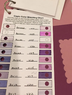
Good morning! After Monday's post on matching your Copics to specific colors I had a question about which tone I use to match the color. It was something I really had to give some thought to, because I DON'T think about it as I'm matching colors, I just do it. My first inclination was "well, THE color you want your image to be" but as I thought about the question some more, it made sense.
Do I match to the light, medium or dark shade? For those who don't use Copics, generally when shading you will pick a light, medium and dark marker in the same color family. All markers have two numbers - the second being relative darkness; the higher the number the darker the shade. I decided to use another Splitcoast Stampers color challenge card as an
example. This challenge was to use Rich Razzleberry, Sweet Sugarplum
and Smoky Slate.
You can see by this photo that RV95 is almost an exact match for the Sweet Sugarplum with RV91 and RV93 just lighter versions. Since I wanted to keep the dragons lighter (they have nice round features which I knew should be highlighted) I picked the two lighter shades and RV0000 to begin coloring. I knew I could use the RV95 in my shadows if needed.
The match for Rich Razzleberry was trickier as no one color stood out as a "match". I chose V01, V06 and RV19. In theory V09 should have been dark shade, but it and V17 were too blue. With Copics you really need a color reference since they're a lot like lipsticks - what you see on the package may have little relation to the color inside! And even with their logical numbering system, you can still have that outlier. (Just look at V04! It does not look like it falls in sequence with the V0 family.) When blending from different color families you need to experiment. Eventually it becomes easier as you become more familiar with the colors.
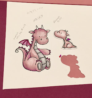
Below is my trial run with colors. You can see I used the inverse of shading on the large dragons wings. And it appears I did not even use RV95, my match for Sweet Sugarplum.
If I had been coloring a solid, flat area I would have definitely used the RV95, but with shading I chose to go with lighter colors and match the highlights since using the RV95 could get the image dark really fast. If the color I'm matching is a light to medium shade then I'll try to match to the highlights or mid-tones. If the color is dark, I'll try to match more the shadows. Remember - it's much easier to add color than take it away!
I hope this helps with picking markers when trying to match a specific color. If you have any questions please comment or email me!
Stamps: My Favorite Things Magical Dragons
Die: Penny Black Imagine
Cardstock: Stampin' Up! Rich Razzleberry and Whisper White
Copic markers: Little dragon RV0000, RV91, RV92; Big dragon RV0000, RV91,RV93, V06, Wings V01, V06, RV19; Feet and belly N0, N1, N2, N3
I also used a LOT of Wink of Stella on this card!
Thanks for visiting!


This is a fabulous explanation of how you made your choices. Thank you very much.
ReplyDeletePS: I tried to reply to your kind response to my Splitcoaststampers question but i can't get it to send. I'm very appreciative of your taking the time to help, and directing me to this blogpost. I have now subscribed to your site, I just know it's going to be very informative. As well as filled with fabulous cards, from the little I have seen so far.
Many thanks
Marina
NZ
Hey there, for this little dragon card, what font did you use for your word "imagine"? It seems that your logo is the same font, it is really beautiful..
ReplyDeleteregards
Alison
The word imagine is a die cut using a Penny Black die. It does look similar to my logo font but I don't think it's the same.
DeleteI haven't seen the color matching card before. (Yes, I live under a rock.) I really like that for trying to make sense of my mish-mash of markers. I'll be creating my own - lots of them! - for sorting out my assorted colors.
ReplyDelete